Partial Truths
When incomplete information is seriously misleading

Background
This post is again on aspects of Australia's National Energy Market (the NEM) and its progress with its ‘decarbonisation’ [aka deindustrialisation] journey. It follows this 01 February 2026 post on LinkedIn in response to a 30 January 2026 article from The Guardian [link below].
At the time of writing the LinkedIn post has received many reactions, some highly approving: proof of #GroupThink in action.
(There are also more than 70 comments - two of which are from me, including reference to my post about the NEM exaggerating its percent ‘renewable’ claims.)
The Guardian article which this LinkedIn post featured so approvingly was headlined:
“Australia’s grid now relies on renewable energy as much as coal. Those who doubted it look foolish”
“Those who doubted it look foolish”? Really?
As is often the case -
The devil is in the Detail
The article’s focus was the previous week in January 2026 when high temperatures across parts of eastern Australia resulted in high power Demand, and how “solar provided 30% of all electricity in the country’s main grid, which supplies the five eastern states and the ACT. That’s across day and night.” [My bolding]
“… across day and night”. Really? Let’s have a look at what the data can tell us, if only we are willing to open our eyes (and minds) to see:
Figure 1: January 2026 in the NEM:
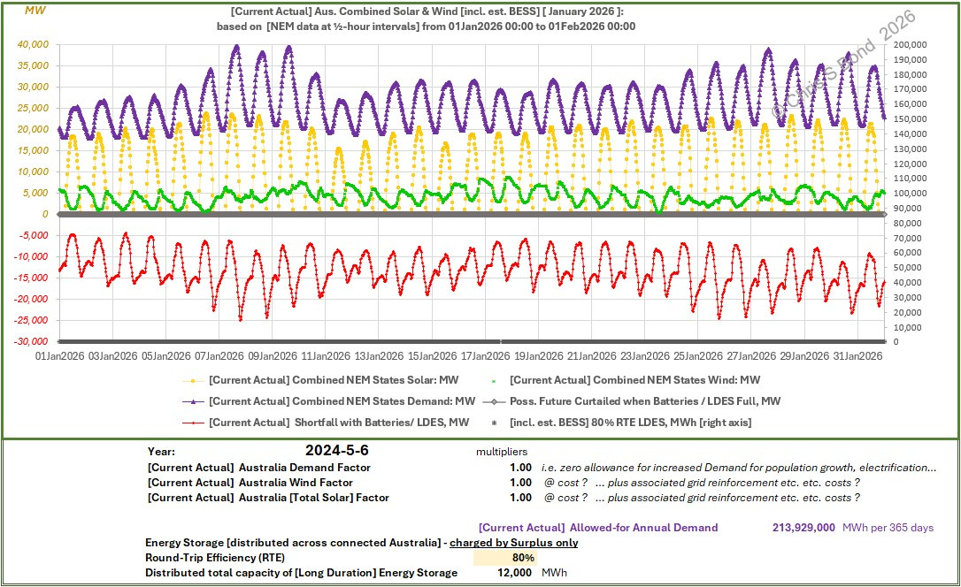
Later on in this post I explain how I derive the Demand1 (purple) as well as the [fossil-free] Shortfall (red) plots.
Engaging with reality, we can see that the difference between Demand and the total of low-carbon sources of power, varies between around -5,000 MW in the middle of summer days, and a yawning chasm of around -25,000 MW in the middle of hot nights, even when Wind is cooperating.
Follow the Guardian’s urging and Australia will be enjoying paleo power before too long.
The article also included this text:
“In parts of the year, renewables are now ahead. The Australian Energy Market Operator this week described the last three months of 2025 as a “landmark moment”, with renewables’ share in the quarter rising beyond 50% for the first time.”2
Instead of the hyperbole, let’s take a look at the ½-hourly data from the NEM for that 3-month period. As I did for Figure 1, I’ve plotted it in ways I doubt would ever be featured in the Guardian, nor Open Electricity for that matter. Doing so, I show there was never zero need for dirty dirty fossils to keep the lights on across the NEM grid in 4Q2025. The darned sun just kept going AWOL, regular as clockwork.
Unless you show (or at minimum, state) this obvious fact, I think your article will seriously mislead many readers.
I suggest, if you are at all interested in being factually transparent, you need a presentation such as included in Figure 1 or Figure 2. Much, much less misleading and more useful than that Guardian article / headline.
Figure 2: NEM ½-Hourly data 01 Oct 2025 thru end of 31 Dec 2025:
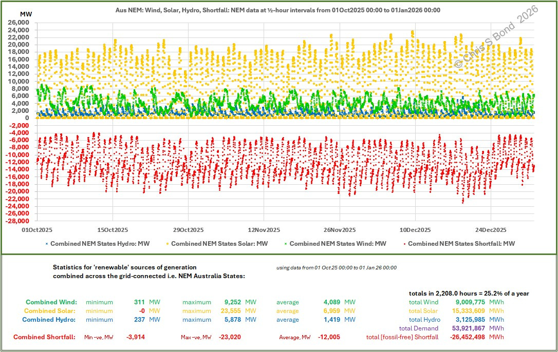
There is a fragment of truth in the article: averaged across the entire 3 months, ‘renewable’ sources of electricity (Wind plus both types of Solar plus Hydro plus tiny amounts of ‘Biomass’) satisfied just over 50% of the total MWh of 4Q2025 NEM electricity Demand.
But in NONE of those 2,208 hours, i.e. NEVER in any of those 4,416 ½-hourly intervals, did ‘renewable’ sources satisfy all of that ½-hour’s Demand. So, no way did it satisfy Demand “… across day and night.”
Of course, this relies on knowing what is Demand.
Apparently, for some it’s too hard to determine, while batteries are charging and discharging, and Wind is blowing and not blowing, and Solar power is up and down on the rigidly regular, and sometimes there are power Imports… Ah, no, that last item is only for a State, not for the NEM as a whole. (Nor for the isolated SWIS, but that’s an aside.) So Open Electricity doesn’t determine it. Hey, OE, these things called computers are really good at crunching numbers!
Because, actually no, it’s not at all hard to work out what Demand is. (At least close-enough for government work, as an old colleague used to say).
The fundamental principle of keeping a power grid stable is that:
Electricity Supply must = Demand every ½-hour. (It’s physics.)
Ergo, Demand must = Supply every ½-hour.
That is, for every ½-hour interval of NEM data, Demand equals the arithmetic sum of all the power flows. Negative power flows (into batteries, or pumping water up hills) just act as negatives in the summation.
So that’s how I can determine the Demand ½-hour by ½-hour throughout the period, which allows me to produce the purple Demand plot in Figure 1 and Figure 3.
Figure 3: NEM ½-Hourly Demand and Shortfalls, 4Q 2025:
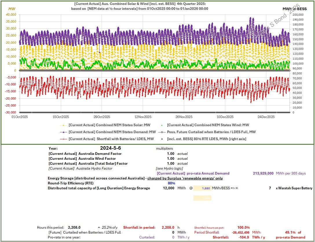
For clarity, I omitted Hydro from Figure 3. (You can see from Figure 2 how relatively minor the hydro generation is, in context.) Instead I plotted Demand (purple), which is how I can plot the [fossil-free] Shortfall (red) i.e. by how much all the low-carbon sources of electricity failed to meet Demand each ½-hour.
And, in the Excel file, you can have a simple count of all the ½-hour intervals when Shortfall was ≤ 0. That’s 100% of the time, folks.
But… Batteries
Ah, yes, batteries to the rescue! Open Electricity has recently modified how it presents its Battery Energy Storage System (BESS) tracking to differentiate between operating and commissioning facilities.
(I wonder if my scathing comments in previous posts had anything to do with that? If yes, dear OE, please take on board my scathing comments herein about including Demand and [fossil-free] Shortfalls in your NEM and State-by-State presentations. Also, dear OE, please make granular data - ½-hourly at minimum - available for longer than just the last 7 days. And for crying out loud, stop varying the number of columns in each .csv data-file depending on use or non-use of a marginal source of power in a given time interval: a column which does not jump around but which has regions of zeroes among the numbers would be hugely preferable!)
Figure 4: Operating BESSs on the NEM as of 07 Feb 2026:
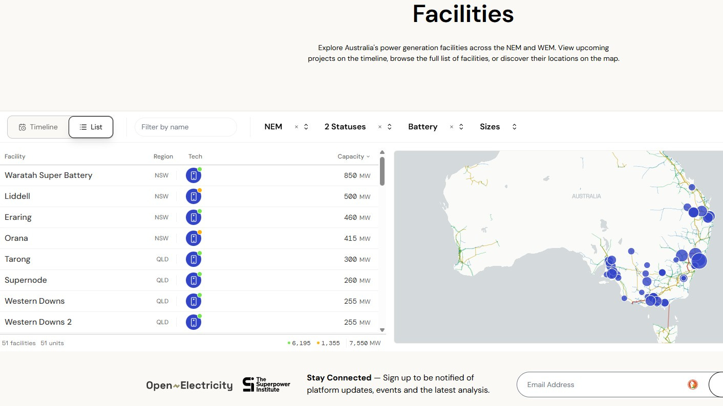
So now, after the change to how the data is presented, the Facilities, Batteries, Region NEM, Status ‘Operating’, sorted in descending order of Capacity, produces the image shown in Figure 4. Little colour indicators show whether a facility is ‘operating’ (green) or ‘commissioning’ (amber). The Waratah Super Battery is shown as ‘operating’ although we all know of its major transformer woes (1oo3 wrecked, 1oo3 too suspect to be actually operated was the last I saw) and if you click to bring up the facility info it’s going at barely 1% capacity factor.
In this presentation we’ve lost the claimed total MWh installed: my guess is approximately 2 hours average for the ‘operating’ 6,195 MW ≈ 12,000 MWh.
The NEM fleet of BESSs is currently charging and discharging depending on power cost ‘arbitrage’: buying low and selling high. Whether that’s an instance of ‘privatising profits, socialising costs’ I’ll leave to Australian bill-payers / tax-payers / voters to decide.
What is completely evident from Figure 1 and Figure 3, however, is that there is no ‘surplus renewable’ power going into batteries: it’s mostly fossil generation.
I’ve identified one problem facing the NEM: Solar power alone cannot keep the lights on. There is a 24-hour cycle of power abundance and power poverty. Putting aside the even harder problem of seasonal variation, how much BESS capacity would be needed simply to smooth that abundance / poverty cycle into steady continuous power? (IF you get the BESS energy storage capacity you can obviously then choose to release energy from it faster or slower to better adjust to the real Demand cycle.)
According to the OE Records page for Solar generation, the highest ever day of Solar generation in the NEM was 09 December 2025, yielding 222,329 MWh of energy (with mentions of peaks of 23,858 MW at 1:25pm and 23,836 MW 1:10pm).
Using ½-hourly data for that day I produced the plot shown in Figure 5.
Figure 5: Smoothing NEM Solar Power Using BESSs:
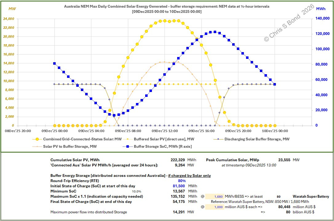
If you average 222,329 MWh across 24 hours you would get a steady 9,264 MW. This on a day when Demand varied between 19,447 MW at 03:30, to 33,860 MW at 15:30.
So that steady BESS power release would be between 47.6% of Demand in the middle of the night, to 27.4% of peak Demand in the early afternoon. Useful.
But at a total cost for BESSs of something around AUD 80 billion or so.
Mindblowing!
Copyright © 2026 Chris S Bond
Disclaimer: Opinions expressed are solely my own.
This material is not peer-reviewed.
I am against #GroupThink.
Your feedback via polite factual comments / reasoned arguments directly relevant to the material in this post, are welcome.
As a reality-check on my numbers, I downloaded the 1-year x daily NEM comma-separated variable (.csv) data-set ending 05 Feb 2026. These are daily numbers, so are useless for telling us whether the lights would stay on, but the daily energy totals are valid and hence so too are the annual totals:
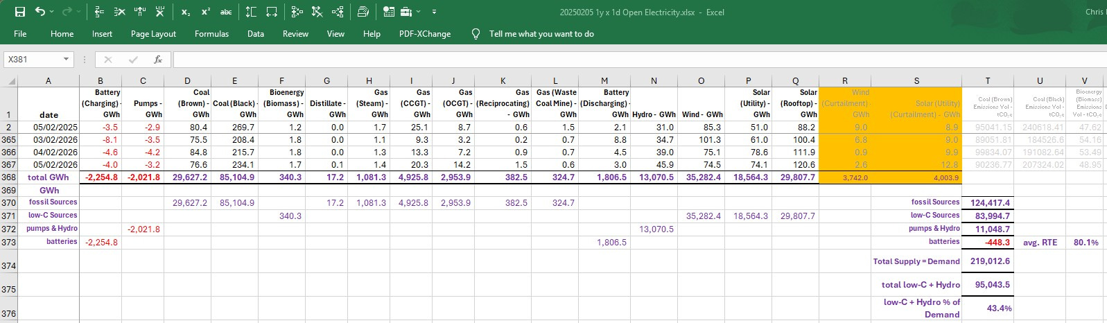
fossil Sources: 124,417.4
low-C Sources: 83,994.7
pumps & Hydro: 11,048.7
batteries: -448.3 ==> avg. RTE 80.1%
Total Supply = Demand: 219,012.6
total low-C + Hydro: 95,043.5
low-C + Hydro % of Demand: 43.4%
Can a quarter of a year truly be described as a ‘moment’? Yeah, nah! Quickly moving on.
Look at he low points like a fence or a flood levee. Windless lights are the weak links in the RE cain.
https://www.flickerpower.com/index.php/search/categories/renewables/21-7-intermittent-solar-and-wind-power-can-displace-coal-but-cannot-replace-it
Where does your estimated cost of the BESS (AUD 80 Billion) come from. This is £40 billion for 8GW of BESS, £5 million / MW. That seems incredibly expensive in the UK when I was working in the market 2 years ago we were looking at c. £800k / MW.