

Another 28 Days Later
Further food for thought for David Osmond following his X post covering Australia's NEM up to midday 18 June 2025

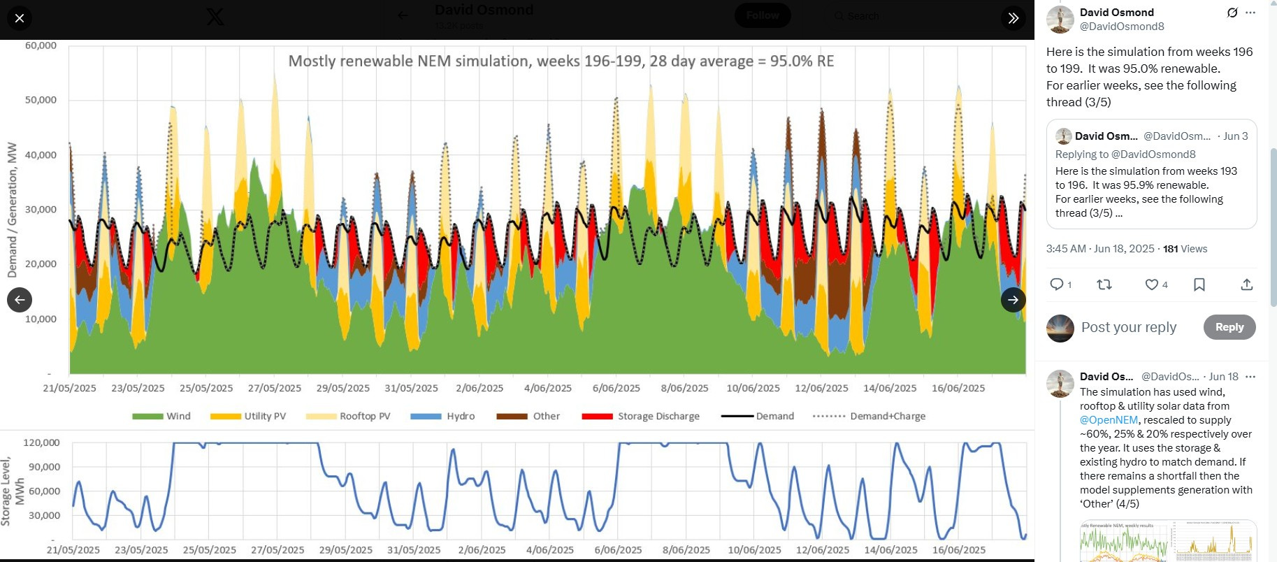
This is a comparison with David Osmond’s [week ending 18 Jun 2025] X post where he claims: “Here is the simulation from weeks 196 to 199. It was 95.0% renewable.” Running energy balances for the same 28 days of NEM data, I get a significantly lower percent ‘renewable’, see below.
From the first post in that thread covering 11th-18th June 2025, he shows he used scale factors Wind 4.2, Utility PV 2.5, Rooftop PV 1.9. So in my analysis below I’ve done likewise.
But from another post in that thread: “The simulation has used wind, rooftop & utility solar data from OpenNEM, rescaled to supply ~60%, 25% & 20% respectively over the year. It uses the storage & existing hydro to match demand. If there remains a shortfall then the model supplements generation with ‘Other’”. My bolding on the “existing hydro” because in separate X DMs he told me that in fact his “simulation” re-allocates Hydro from times of surplus RE to times of Shortfall.
But how it does so is completely opaque. He kept pointing me to his Aug 23, 2023 Renew Economy article instead of answering numeric questions about his last “simulation”.
So, ok, I’ll show him mine (my numbers) in the hope that he’ll show me his (numbers, for the avoidance of doubt).
My analysis in this post is based on NEM ½-hourly data 21 May 2025 12:00 to 18 June 2025 12:00 which I’ve collected over the last several weeks. This period is featured in DO’s X-post per Figure 1.
Figure 1: DO’s “Weeks 196-199, 28 day average = 95.0% RE”
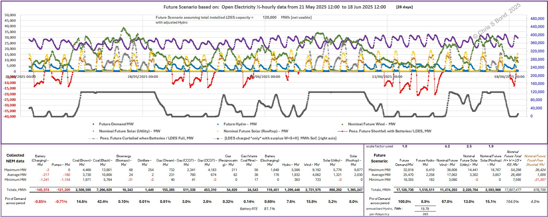
For reference, because I think it always helps to show where we’re starting from, I’ve plotted the key parameters from the 28 days of NEM data in the plot below. I’ve calculated the numeric totals (MWh) for all the sources of NEM generation, and the percentages they satisfied of the period’s total Demand, see the tables at the foot of Figures 2A & 2B.
Figure 2A: NEM Data and Energy Totals, 21May-18June 2025:
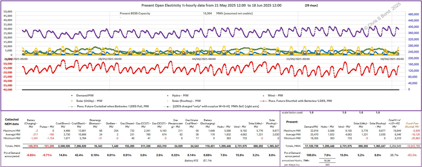
Note: the calculated round-trip efficiency of the Australian fleet of battery storage is 81.1% as shown at the bottom. For simplicity in my calculations with storage I use 80%.
You can see that Hydro, the blue line in Figure 2, is being varied (daily). Hydro generation is increased in the nights i.e. between the surges of Solar generation. It also looks like Hydro has larger variations when there is a Shortfall of Wind, smaller variations when Wind is in excess.
Maximum Hydro in this 28 days is 5,566 MW; arithmetic average Hydro is 1,932 MW; minimum Hydro is 363 MW; and total Hydro generation across the 28 days is 1,299,446 MWh ~ 1.30 TWh ~ 7.6% of total Demand.
Figure 2B: NEM Data and Overall Energy Balance, 21May-18June:
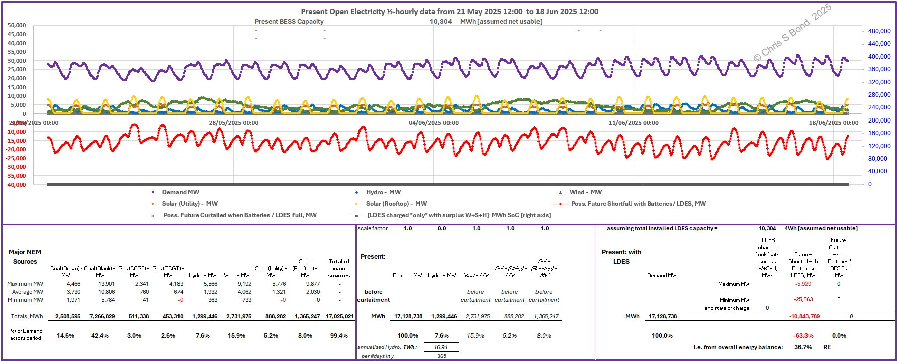
The charts are the same in Figures 2A & 2B, while the tables beneath them are different:
- in Figure 2B I have only included the major NEM sources amounting to 99.4% of the total along the lower left;
- in the middle we see the relative contributions of Hydro, Wind, Utility Solar and Rooftop Solar; and
- on the right the overall energy balance results: 36.7% ‘renewable energy’ RE.
Next, we can look ahead. Of course, we’ll never have an exact repeat of all this weather in the postulated future. But it’s useful to get an indication whether ever more windmills and solar panels could power an industrial economy. David Osmond keeps telling the world that it’ll be both easy and cheap. I’m running my analysis on the same generation data to see if I agree with the ‘easy’ part.
Seeing the basis of some of David’s costs, I very much doubt the ‘cheap’ part.1
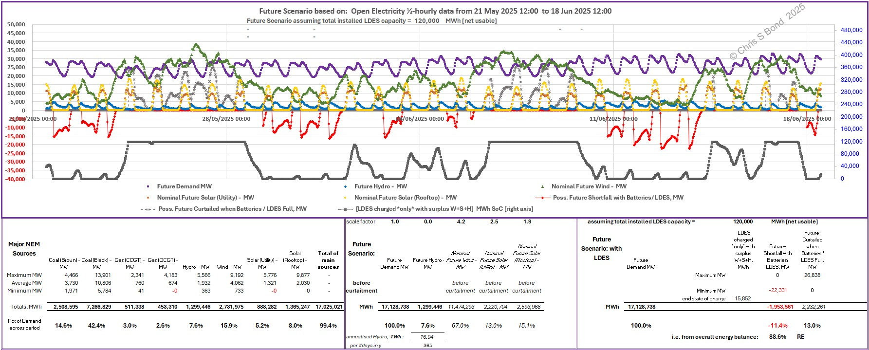
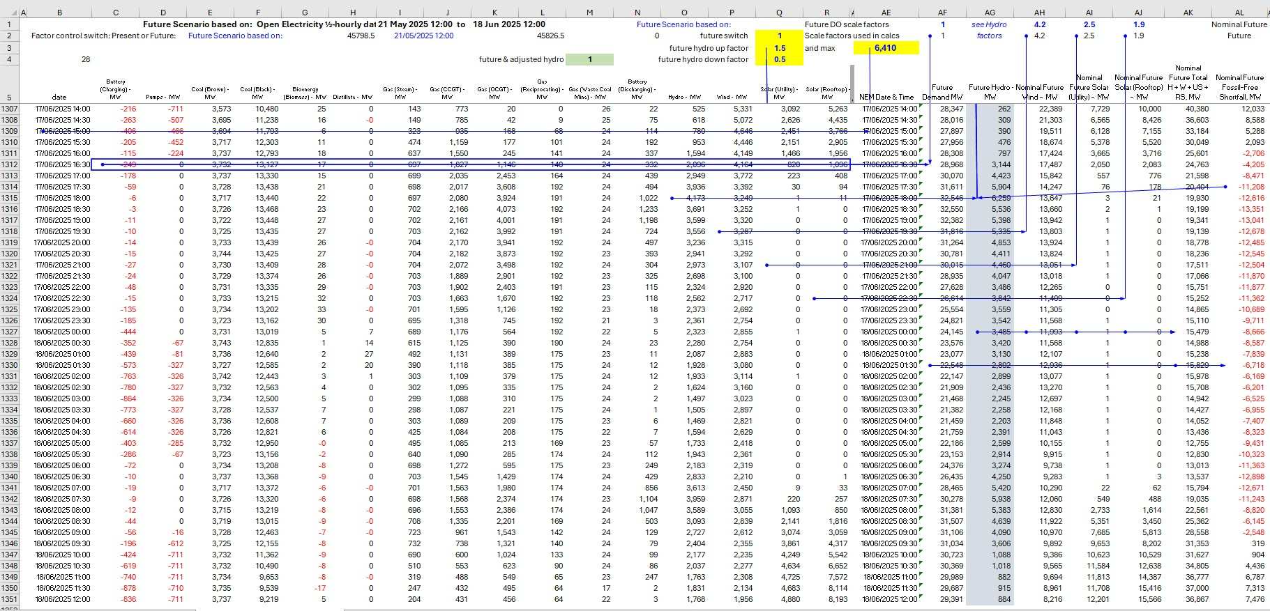
Figure 3A: Future NEM, DO Scale Factors, Unchanged Hydro:
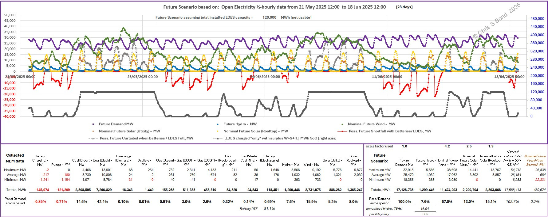
Figure 3A shows the charts with the David Osmond scale factors applied but with no adjustments to Hydro. Note I label the Wind and Solar totals in the lower right as “Nominal Future”… because without Demand or empty energy storage available, any surplus generation would have to be curtailed to keep the grid frequency stable. And you can only determine *that* by performing logical tests on each relevant parameter ½-hour interval by ½-hour interval - see the algorithm outline below Figure 3B. This is the arithmetic equivalent of the grid operator controlling generation must equal Demand in real time.
Straight away you can see that DO’s scale factors result in Nominal Future Total H + W + US + RS = only 102.7% of Demand across the 28 days. That’s a very thin margin to hope that that 7.6% share of Demand provided by Hydro could realistically be boosted to fill the gap.
You can also see more clearly in either Figure 3A or Figure 3B, how existing Hydro has been varied by the grid operator. Higher Hydro peaks [blue chart] correspond with Shortfalls [red chart]; higher Wind [green chart] *and* lower Hydro correspond with future LDES being fully charged [black chart], i.e. RE being in [potential] surplus.
Figure 3B: Same Hydro, DO Scale Factors, Future Energy Balance:
Logical Tests = Physical Limits Algorithm
The overall energy balance in the bottom right corner of Figure 3B shows the results after performing logical tests ½-hour interval by ½-hour interval as time progresses through the entire 28 days:2
- is RE > Demand? No
- then is there energy in LDES? Yes
- then use that stored energy to counter the Shortfall, and reduce stored energy by amount {[reduction in Shortfall that ½-hour, MW * 30/60]/ RTE} MWh
- and so on until LDES is zero, then there’s no stored energy to counter a Shortfall, the ‘battery’ is flat…
until
- is RE > Demand? Yes
- then is there empty capacity in LDES? Yes
- then use RE to satisfy Demand and use surplus RE to charge energy storage
until
- is RE > Demand? Yes
- then is there empty capacity in LDES? No, the ‘battery’ is full
- then use RE to satisfy Demand and CURTAIL surplus RE
until
- is RE > Demand? No
and so on.
After doing these step-wise calculations to constrain the system within the physical limits of the Future NEM with 120,000 MWh of energy storage (batteries or pumped hydro energy storage or a mixture of both):
the overall percent Shortfall = -11.4%
i.e. overall 88.6% renewable energy (RE).
Hydro generation in that 28 days is 1,299,446 MWh
= 7.6% of Demand
[Note: Demand is unchanged from current, i.e. zero allowance for ‘electrifying everything’, population growth, etc.]
Annualised, that Hydro would be 16.94 TWh, to be compared with the last actual year’s Hydro = 13.536 TWh. Also from that last actual year’s records we can see that maximum Hydro was 6,410 MW, so I’ve used that as the upper limit to Future Hydro when I’ve adjusted Hydro below.
Thus in this 28 days, recorded Hydro generation was already at an above-average rate.
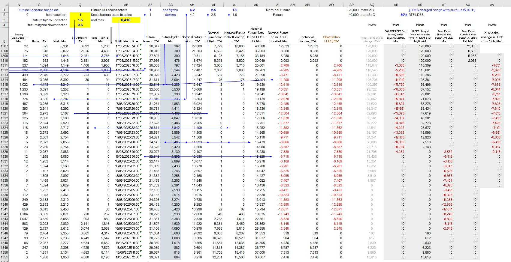
Future NEM with Adjusted Hydro
Let’s see the effect of vary future Hydro, ½-hour by ½-hour, according to what happened in the previous ½-hour, as follows:
Future Hydro = 1.5 times actual Hydro if the previous ½-hour interval has a Shortfall, but with upper limit 6,410 MW;
or Future Hydro = 0.5 times actual Hydro if the previous ½-hour interval interval has a Surplus.
I repeated the analysis while again performing the Logical Tests = Physical Limits algorithm ½-hour interval by ½-hour interval as time progresses through the 28 days to satisfy grid stability etc. ultimate constraints.
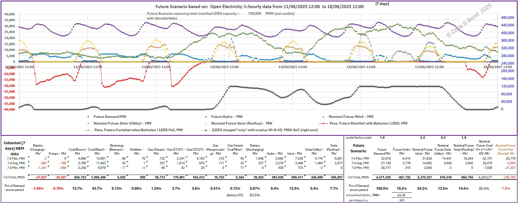
Figure 4A: Future NEM, DO Scale Factors, Adjusted Hydro:
You can see I have deliberately and explicitly plotted a chart (grey markers, dashed line) showing the Curtailed generation. You can see this Curtailment only appears when LDES is full *and* when Wind is High *and* especially when this coincides with the daily surge of Solar. I look at this in greater detail below, see Figures 6A & 6B.
Figure 4B: Adjusted Hydro, DO Scale Factors, Future Energy Balance:
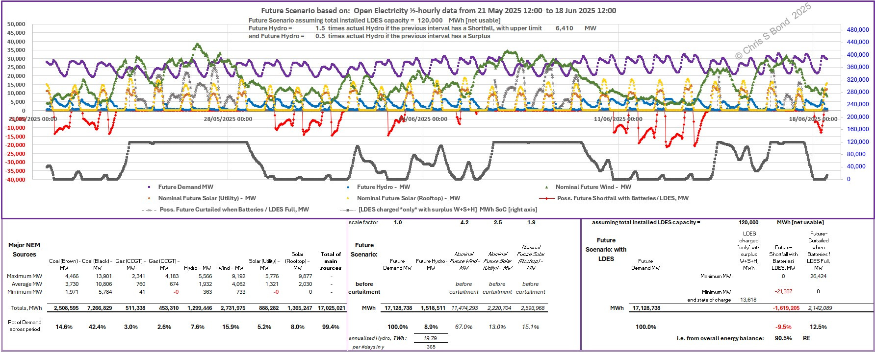
Using the Hydro adjustment factors shown: 1.5 times when there is a RE Shortfall but limited to maximum 6,410 MW; 0.5 times when there is a RE surplus; we end up with 9.5% RE Shortfall from the overall energy balance, corresponding to 90.5% RE. Quite a long way short of Mr Osmond’s claimed “95.0% renewable” in this same 28-day period.
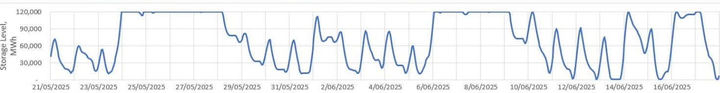
His ‘Storage Levels’ chart has similarities, but also significant differences:
Remembering that adjusted Hydro across this 28 days would total 1,518,511 MWh i.e. 8.9% of Demand, equivalent to an annual usage of 19.79 TWh. That is nearly 1½ times the overall rate of last year’s total Hydro generation. I’m guessing Aus is unlikely to ‘burn through’ scarce Hydro at that rate, but even if it did the RE percentage would be lower than DO claims.
Note how, in my analysis, the energy that must be Curtailed totals up to 2,142,089 MWh. If, somehow, Mr Osmond’s “simulation” hides some of this away in a secret stash, then the difference might be explained. But his X posts don’t provide any transparency over his numbers, or whether his “simulation” abides by all the physical limits of the energy system.
Let’s zoom in on the last 7 days, midday 11th thru midday 18th June 2025.
Figure 5: DO’s “simulation”: last 7 days = 89.7% RE”:
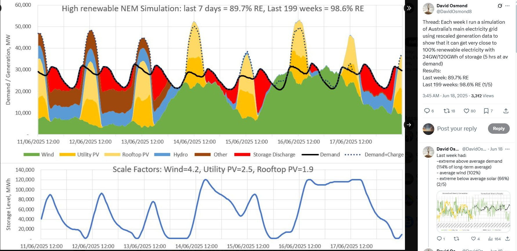
I am puzzled at the peaks going above Demand. The dotted line is labelled “Demand + Charge”… but surely the “Charge” bit is already accounted-for in the rising ‘Storage Level’ plot… double accounting? Also, what’s with the burning of all that “Other” above the Demand line in the peaks of 11/06, 12/06 and 13/06…?
Curiouser and curiouser.
Anyway, here are my plots for the same 7-day period midday 11th to midday 18th June 2025. I simply re-scaled my charts to display those 7 days: all the numbers and analysis for the 21 days preceding midday 11th June are as I charted in Figures 4 above.
Figure 6A: 7 days on Future NEM, DO Scale Factors, Adjusted Hydro:
Of course I had to change the formulas used in the minimum, average, maximum and total tabulation along the bottom, to address only the data from the last 7 days.
Plotting the separate charts for Demand, Wind and Hydro and focussing on the nights, you can clearly see, for example, for overnight 11th-12th June:
- Demand is 30,000 MW falling to say 21,000 MW then beginning to rise again;
- Future Wind (i.e. actual Wind multiplied by DO’s factor 4.2) is about 6,000 MW to about 9,000 MW;
- Future Hydro is maximum 6,410 MW falling to about 4,000 MW;
- LDES goes flat shortly after the sun goes down;
- hence Shortfall is around 30,000 - 6,000 - 6,410 = -18,000 MW, rising (as Demand falls) to around 21,000 - 9,000 - 4,000 = -8,000 MW …
Or, for example, in the middle of the day on 16th June:
- Demand stays at around 30,000 MW;
- Future Wind is around 30,000 MW which alone the night before has exceeded Demand and so has charged up LDES;
- so after the sun comes up LDES capacity is quickly filled by shortly before midday;
- which is when any excess generation above Demand has to be Curtailed (there is nowhere else for it to go for grid stability to be maintained)
And so on.
You can follow it on my charts.
It’s opaque on David’s.
Here for completeness is the energy balance for this 7 days.
Figure 7B: Adjusted Hydro, DO Scale Factors, 7-d Energy Balance:
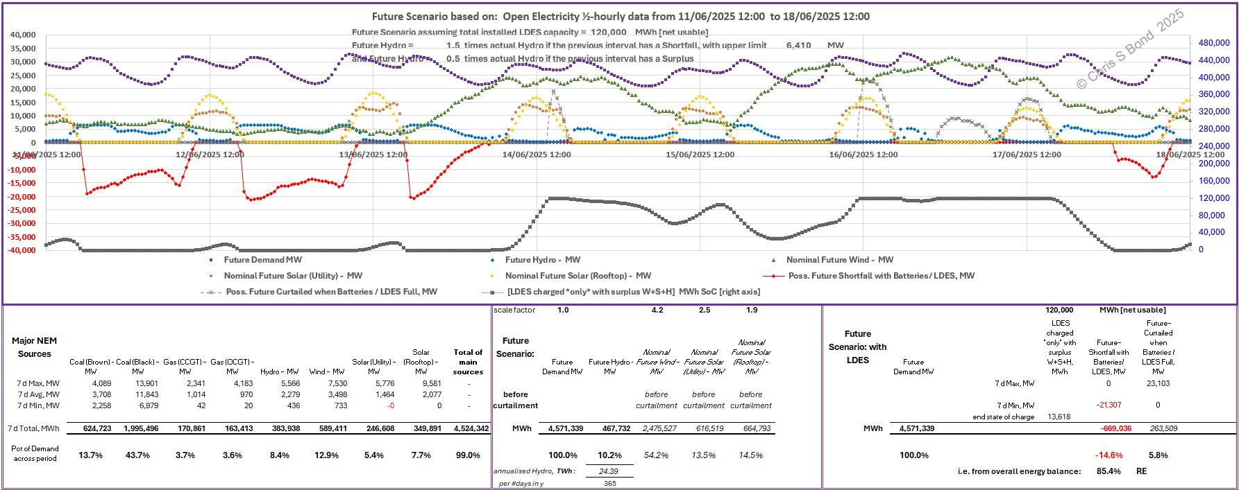
We end up with 14.6% RE Shortfall from the overall energy balance, corresponding to 85.4% RE.
To do so we need 10.2% of that week’s Demand to be generated using Hydro. Credible?
(By the way, if you look closely at my Hydro chart you can see it ‘jitters’ a bit when Demand and Supply are finely balanced. This is simply because my logic test ‘is there a Shortfall in the previous ½-hour interval’ flicks between ‘yes’ and ‘no’ and back. The overall effect on the results, however, is trivial: so I haven’t bothered to adjust it.)
Anyway, referring back to Figure 5:
I am puzzled at the peaks going above Demand.
The dotted line is labelled “Demand + Charge”… but surely the “Charge” bit is already accounted-for in the rising ‘Storage Level’ plot… double accounting?
Also, what’s with the burning of all that “Other” above the Demand line in the peaks of 11/06, 12/06 and 13/06…?
Over to you, David Osmond
If you have a RELEVANT polite technical argument to let me know where you think my ½-hourly energy balances are incorrect, please let me know. If you just want to deny without providing numerical evidence, or you wish to indulge in irrelevant obfuscation, I’ll ignore you.
P.S. for Peter Farley: Pumped Hydro Energy Storage ≠ Hydro
Copyright © 2025 Chris S Bond
Disclaimer: Opinions expressed are solely my own.
This material is not peer-reviewed.
I am against #GroupThink.
Your feedback via polite factual comments / reasoned arguments welcome.
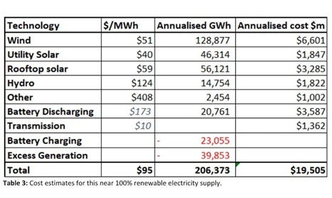
DO’s Renew Economy article uses LCOEs as the basis for his ‘cheap’ claims - see his Table 3 below. As Prof Dieter Helm says, this “fantasy is … based on the elementary confusion of the marginal cost of electricity generated from a solar panel or a wind turbine with the system costs of firm power…” It’s worth reading “Full cost of electricity ‘FCOE’ and energy returns ‘eROI’” or the more recent “CATF – Beyond LCOE: A Systems-Oriented Perspective for Evaluating Electricity Decarbonization Pathways”
Detailed examples of my calculations for the last 22 hours of the period:
Columns B thru R are per the NEM download. All NEM data on CO2 emissions and costs are in hidden columns S thru AC. Column AD is a spacer.
Derived Columns are:
- AE simply repeats the NEM Date & time;
- AF = sum(C:R) of that row = Demand (MW) that ½ hour;
- AG = Future Hydro, adjusted according to the previous interval’s Shortfall (+ve or -ve);
- AH = Nominal Future Wind (excluding any necessary Curtailment);
- AI = Nominal Future Utility Solar (excluding any necessary Curtailment);
- AJ = Nominal Future Rooftop Solar (excluding any necessary Curtailment);
- AK = Nominal Future H + W + US + RS (excluding any necessary Curtailment);
- AL = Nominal Future Fossil-Free Shortfall (excluding any necessary Curtailment or available LDES action)
Further Columns:
- AN filters for potential surpluses, (MW) this ½ hour;
- AO filters for potential Shortfalls, (MW) for this ½ hour;
- AP is blank;
- AQ gives a nominal indication of energy going into or out of storage, without applying RTE or other logic steps;
- AR checks for a Shortfall and if there is sufficient energy stored in the LDES the interval before, uses it to act against the Shortfall. The quantity of energy used in doing so is increased by 1/RTE to account for storage round-trip losses;
- AS keeps track of the actual state of charge of the LDES, ensuring the maximum is limited to the available LDES capacity;
- AT shows the actual Shortfall after the action of the LDES;
- AU keeps track of Curtailed flows of power each ½-hour;
- AV shows some cross-checks on changes of LDES state of charge, MWh.
After reading your article, I figured this was a good time to go back and review my original critique of David's grid model to see if anything has changed. (It hasn't)
You can read my review here:
https://wrjohn1.substack.com/p/nem-grid-model-by-david-osmond
David Osmond's model is deeply flawed. It makes false assumptions and omits key issues and data. You can see my assessment of his model here: https://www.goinggreencanada.ca/David_Osmand_near_100pc_Grid.pdf