Exaggerating Progress on the NEM
The surprises that turn up when claims presented on a 'decarbonisation' advocacy website are closely interrogated

Header note1
Background
Australia's National Energy Market (the NEM) operates the electricity grid across Eastern Australia. I’ve posted before on Australia’s developing electrical energy landscape, for example here, if you need background.
Open Electricity is a publicly-accessible website offering data and graphics purporting to show how far Aus has progressed on its ‘decarbonisation’ [aka deindustrialisation] journey.
Under “Transparency & Accountability” on the ‘about’ page it says:
“Open Electricity is developed under the Open, Accessible, Auditable Data (OAAD) framework. OAAD was developed by The Superpower Institute to accelerate Australia’s climate energy transition.” [My bolding]
“Getting measurement right is a fundamental building block for transparent markets. The OAAD framework will ensure that critical climate and energy data is available to all, allowing industry, researchers and policy makers to better inform and improve their work.”
… and “Other Supporters” includes these guys:
Okay, Open Electricity is clearly pro ‘renewables’.
How about those other aims: transparency; data available to all, allowing better outcomes?
How might those aims be affected by inaccuracies in the numbers presented?
What? Inaccuracies? Read on.
The issue with the Open Electricity numbers presented for the separate States appears to be driven by how the website [opaquely] deals with Import and Export energy flows and how they relate to the tabulated “Contribution to demand” numbers in the tables shown to the right of the plots. The worst-case example over recent weeks has been Victoria, so I’ll focus the detail on that.
Figures 1: Victoria, 7 Days, 03Jan-10Jan 2026:
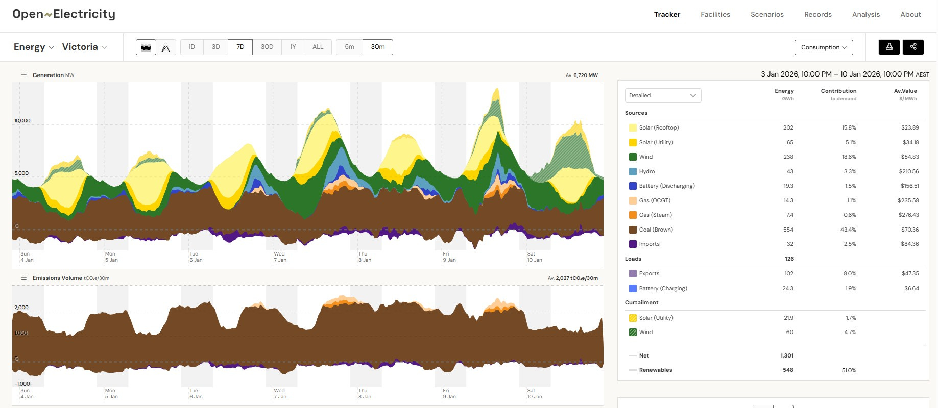
The 7-day view presented by Open Electricity for a State (upper image) includes the handy table on the right. At the lower right corner of that table is the stated “Contribution to demand” of 548 GWh of ‘Renewables’ which is presented as 51.0%. Impressive, if true.
But the huge [hidden] question is: what is the Demand across that 7 days of which
548 GWh of ‘Renewables’ is 51.0%?
Open Electricity doesn’t publish Demand numbers. I assume that they know that electricity Supply must = Demand every time interval (this data is ½-hourly). I have been working on the presumption that Demand within a State in a given interval equals the sum of all the energy flows they call “Sources” minus those they call “Loads”.
Except, that doesn’t produce numbers that match.
In the table at the right of the lower image I present the results of my calculations.
For each source of energy, a number of GWh of power is shown to provide a percentage “Contribution to Demand”.
Hence divide the GWh number by the percent and you see the GWh Demand they must have worked from.
Accuracy is higher for higher percentages, so the derived Demand from the highest percent contributor is true Demand: for these numbers that is 1,276 GWh.
Then 548 GWh of ‘Renewables’ divided by 1,276 GWh gives 42.9% not 51.0%
Double-checking the numbers in the table, ‘renewable’ Sources do add up to 548 GWh.
Back-calculating Demand from 548 GWh of ‘Renewables’ equating to 51.0% would be 1,075 GWh which is incompatible with all the other entries in the table.
I note that the “Net” figure at the lower left corner of the table is 1,301 GWh, which I can arrive at by ADDING the Loads to the total of the Sources. But it is not obvious how or even whether Open Electricity is using that Net number - and it is certainly NOT equal to Demand.
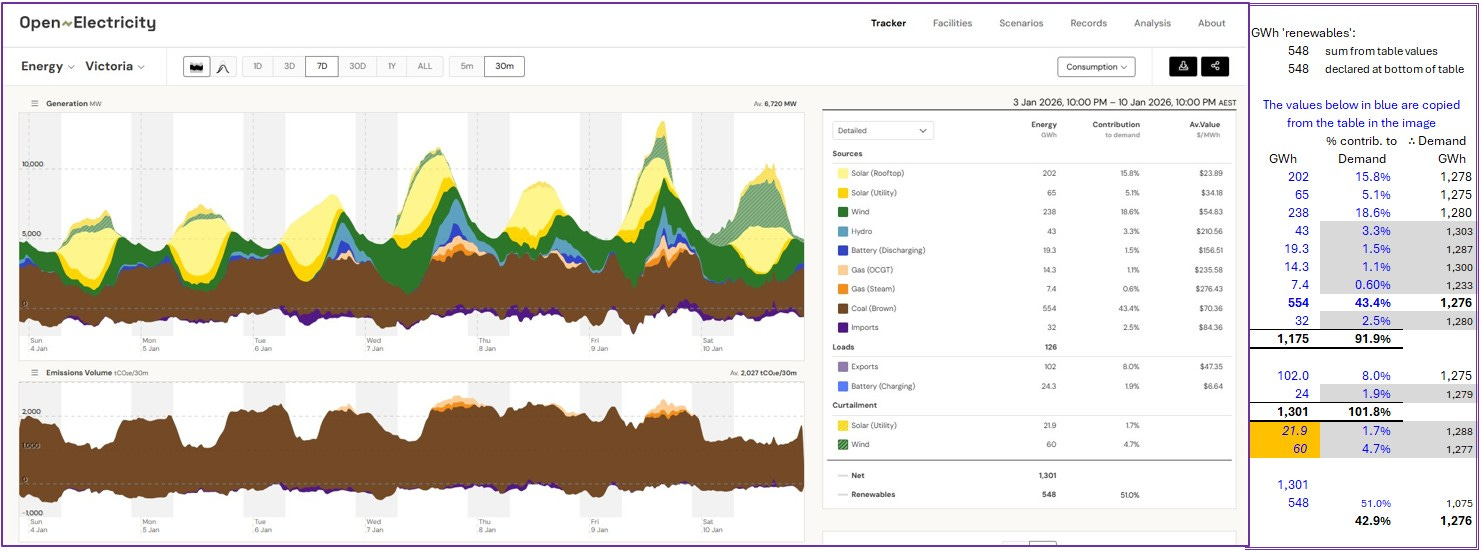
Looking at the next week, again from Victoria, and it’s worse.
Figures 2: Victoria, 2 Weeks, 10Jan-17Jan 2026:
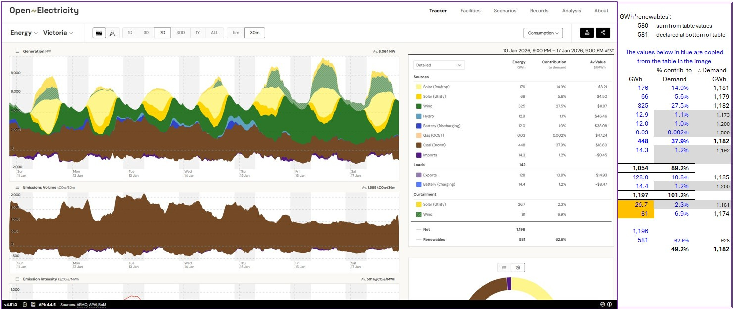
Similar story again.
Claim: 581 GWh of ‘renewables’ = 62.6%. V impressive, Victoria! I bet it makes you proud!
Except.
Demand back-calculated from 448 GWh of Coal (brown) being 37.9% = 1,182 GWh.
581 GWh of ‘renewables’ in 1,182 GWh = 49.2%
That’s over 13 percentage points lower than presented.
Fake news?
As this post has taken most of a week to compile, I’ve looked at the next week’s data. Similar exaggerated claims are evident for the worst State, which is again Victoria:
Figures 3: Victoria, 2 Weeks, 17Jan-24Jan 2026:
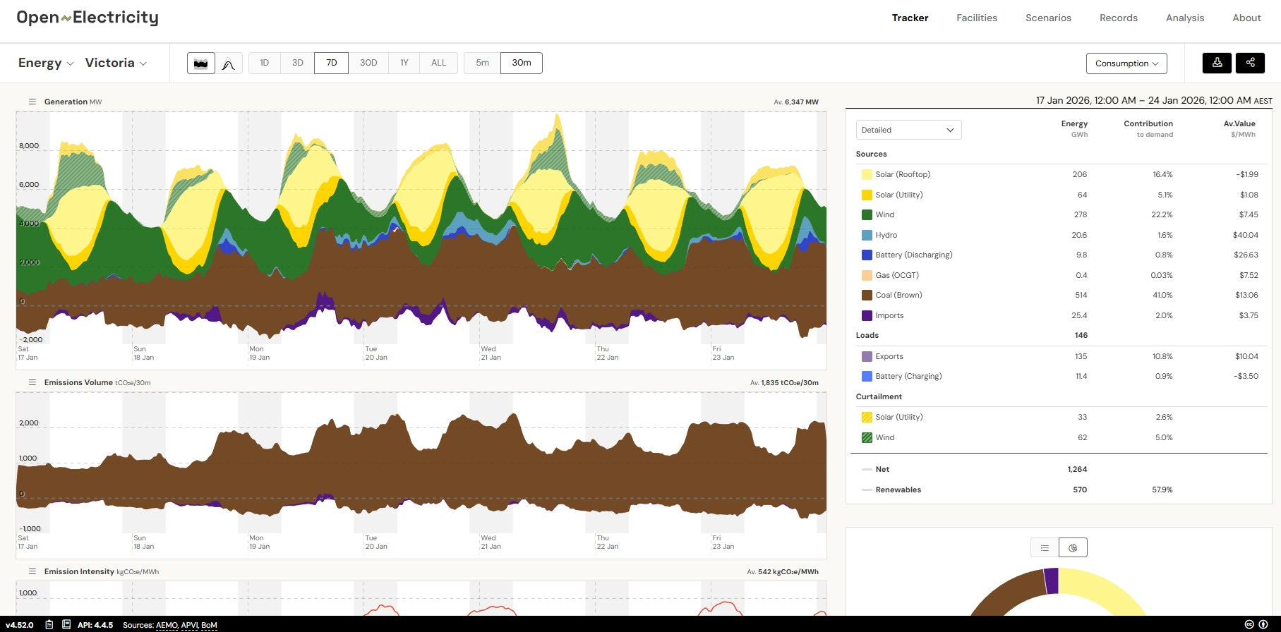
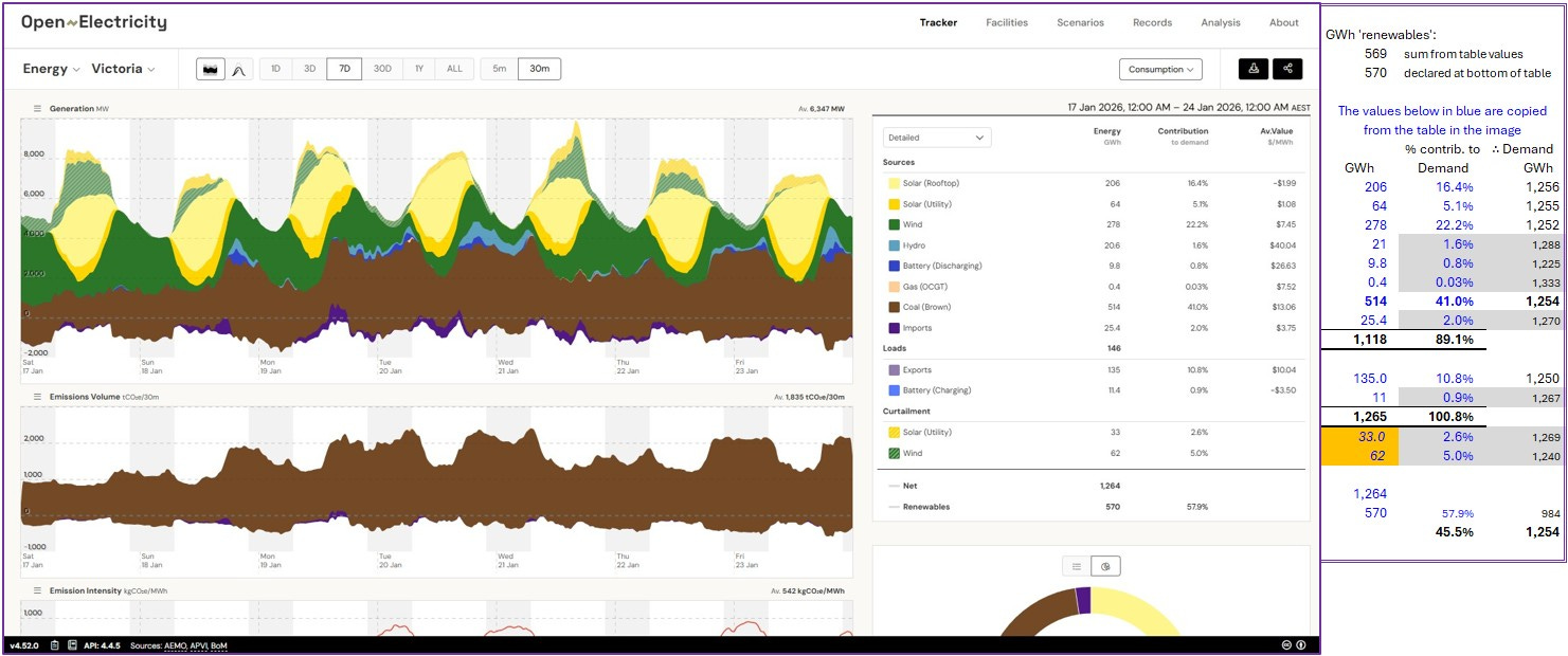
The % ‘renewables’ claimed for the other States all err similarly, i.e. claim is greater than reality, but not quite as dramatically. I’ll just summarise my results in Figures 4. [I generated all2 the detailed results, I just don’t wish to be tediously repetitive.]
Figures 4: NSW, S.Aus, Qld, NEM results Summaries, 03Jan-24Jan 2026:


The good news for Open Electricity is that for the NEM area, the actual percent ‘renewables’ looks to be slightly higher than claimed.
The less-good news is that the percent ‘renewables’ for each of the States look to be exaggerated by significant factors.
Where are those ‘Error Tracking Software’ guys when you need them?
Copyright © 2026 Chris S Bond
Disclaimer: Opinions expressed are solely my own.
This material is not peer-reviewed.
I am against #GroupThink.
Your feedback via polite factual comments / reasoned arguments directly relevant to the material in this post, are welcome.
Digging into Australia’s Open Electricity claims of percent ‘renewables’ in separate States in the NEM, and finding consistent over-claiming.
Tas data is simpler as illustrated by the week’s data below:
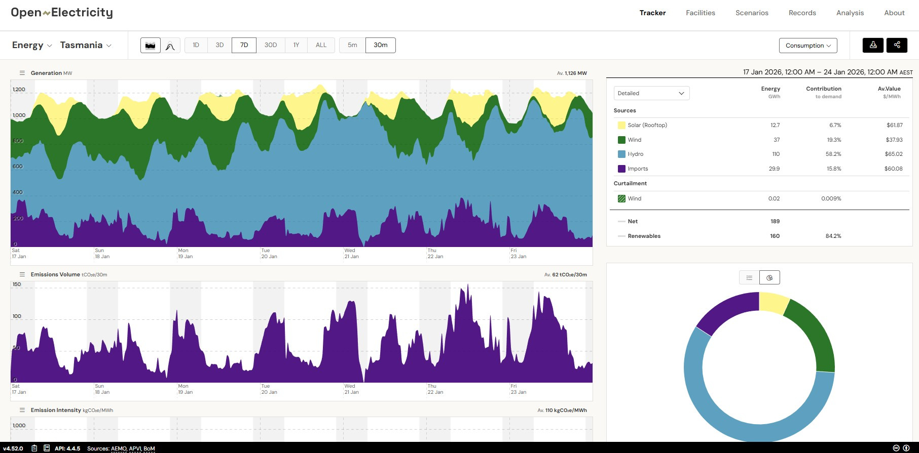
There, imports provided 15.8% contribution to Demand, and ‘renewables’ was claimed to be 100 - 15.8 = 84.2 %. That’s a slightly low claim because of the varying proportion of ‘renewables’ in the imported power.
Very interesting. I've been using OpenNEM data for some time. I've also worked directly with AEMO data, and that is a nightmare. I suggest you send a link to the people at ... inquiries@openelectricity.org.au and see what they say. You look fairly clearly to have located a bug for them to fix.
OnlyFacts still has the signature chart from OP of the crocodile jaw closing -
https://onlyfacts.io/explainers/track-how-renewables-and-fossil-fuels-power-the-electricity-market