If this post is too long for your email client, click the graphic at the top of the email to transfer to the Substack post. In any case some charts are in ‘gallery view’ and so may not be fully legible. In Substack, you’ll be able to zoom by clicking on the small image.
A note on energy units in this post: the openNEM data is in GWh and is recorded daily. Power flows in GW are *on average* the day’s energy in GWh / 24h. For convenience, where I refer to ‘power’ I’m likely to mean ‘the day’s energy in GWh averaged out across 24h’.
Also note, dd/mm/yyyy date format is used throughout this post.
Summary
Intrigued by seeing claims that Australia can get very close to 100% renewable electricity with 24GW/120GWh of storage, and having recently run an analysis of potential paths to the ‘decarbonisation’ of the isolated grid of Western Australia, I began to adapt the same Excel file to run a similar analysis for the rest of the Australian continent. But I have come to believe that sheer practicability issues - grid capacity and great distances involved - require analysis to be on a State by State basis. So for this post I looked in detail at what South Australia has achieved.
South Australia, congratulations! On average your power generation is roughly two thirds ‘decarbonised’. As you’re undoubtedly aware, to go further while allowing for future electrification and population growth will require substantial increases in grid capacity within the State, and similarly substantial extra interconnection capacity with neighbouring States. It is also likely that you’ll have to accept very substantial levels of power curtailment in the process.
However, from this analysis alone I cannot yet draw firm conclusions about the ‘decarbonisation’ of the rest of the Australian power grid. That will depend on detailed analysis to show whether ‘decarbonised’ neighbouring States would produce surplus ‘renewable’ power in the same hours that SA has shortfalls, and vice versa.
I’ll see what the data shows in later post(s).
Introduction
I’ve been Intrigued by weekly posts from DavidOsmond8 on X formerly Twatter [sic] and which often pop up on LinkedIn: “Each week I run a simulation of Australia’s main electricity grid using rescaled generation data to show that it can get very close to 100% renewable electricity with 24GW/120GWh of storage (5 hrs at av demand) Results: last week: 99.3% RE last 152 weeks: 98.5% RE…” Latest example here.
That makes it all sound a piece of cake, no worries, what are you waiting for, Australia? Just get on and do it!
This is on the back of David’s “A-near-100pct-renewable-grid-for-australia-is-feasible-and-affordable-with-just-a-few-hours-of-storage” article in “Renew Economy” published Aug 23, 2023. David “was eager to produce regular weekly updates to [his] twitter (X) account to regularly demonstrate that close to 100% renewable was readily affordable and achievable.”
In the FAQs of that article we find “this simulation is a highly simplified model of the NEM. It assumes generation on any part of the grid can meet demand on any other part of the grid. For this reason, this aspect of model [sic] is optimistic.”
No kidding!
I like a challenge, so following on from my analysis of Western Australia I started digging into the rest-of-Australia data.
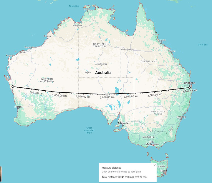
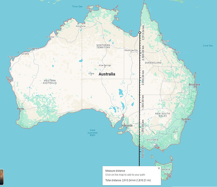
First of all, I think it’s worth emphasising the sheer size of Australia versus the quite modest population of ~27.35 million as of the time of writing.
I used the ‘measure distance’ tool in Google Maps to generate the first two images in Figures 1. East-west: ~3,800km (2,300 mi). North-south including Tasmania: ~3,000km (~1,800mi): these dimensions hopefully include most of the population.
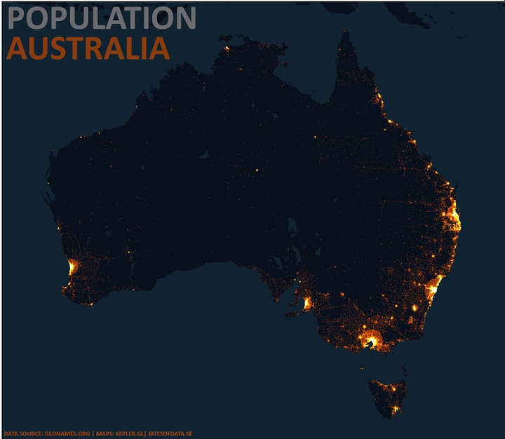
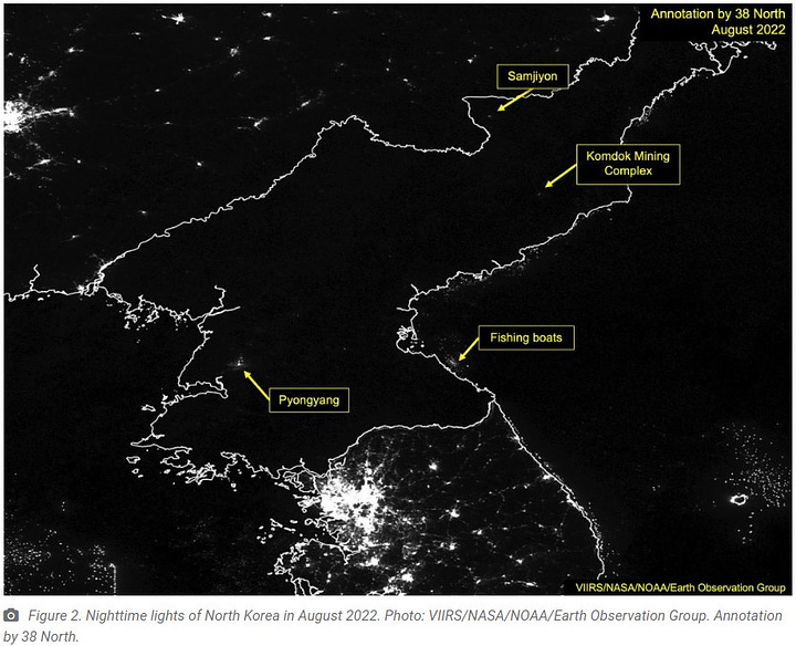
The third image in Figures 1 clearly shows the main Australia population centres clustered along the eastern and southerly edges. (Perth in Western Australia is the glow from the western edge.) In that third image, observant readers will note that sometimes Australia is NOT a solar superpower. If the states and territories of Australia get their energy ‘transition’ planning wrong, the night-time image of North Korea (4th image) may become relevant to future Aussies.
Figures 1: Australia is a Big Place; but its Sunshine is *not* Nocturnal:
I discovered a probable reason why DavidOsmond8 produces weekly updates. The Australian National Electricity Market (openNEM) website is poor compared with the EIA website for US energy data. The NEM only provides high-resolution (5-minute and 30-minute intervals) data for the last 7 days; NEM data resolution for the last year is only at 24-hour intervals.1
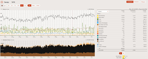
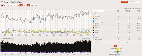
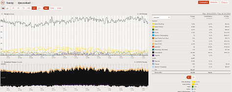
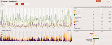
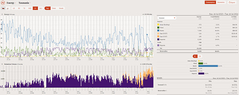
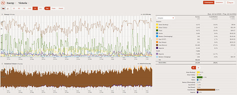
I’ve already analysed the isolated grid of WA. NEM data can be downloaded for Australia as a whole, or separately for each of the remaining five States (New South Wales; Queensland; South Australia; Tasmania; Victoria). The overall pictures, see Figures 2, mostly look chock-full of fossil energy.
Figures 2: Australia Power Data, 1 Year to 15 July 2024:
My usual approach when looking at a territory’s electricity generation is to exclude power interconnections.2 However, these five Australian States already exchange a lot of electrical energy and are extremely unlikely to stop cooperating, so here I’ll keep power interchange.
In each of the charts in Figures 2, data is presented once per day and hence each point is the 24-hour average of the parameter. A feature of the NEM presentation is that Demand is merely implied (because it is inherently equal to the sum of all sources of generation each and every day to ensure each grid remains balanced). In the upper parts of Figures 2 only the various sources of electricity are plotted. The lower parts of each chart in Figures 2 show the CO2 intensity of the power generated: loads of coal and gas, but far less in South Australia (which has loads of Wind and Solar power and good connections to neighbouring states) and far less in Tasmania (which has loads of Hydro power and is also interconnected).
There is far too much data to tackle all the States in one post, so I shall focus in this post on South Australia.3
South Australia
Figure 3: South Australia Generation, 7 days to 10.30pm 26 July 2024
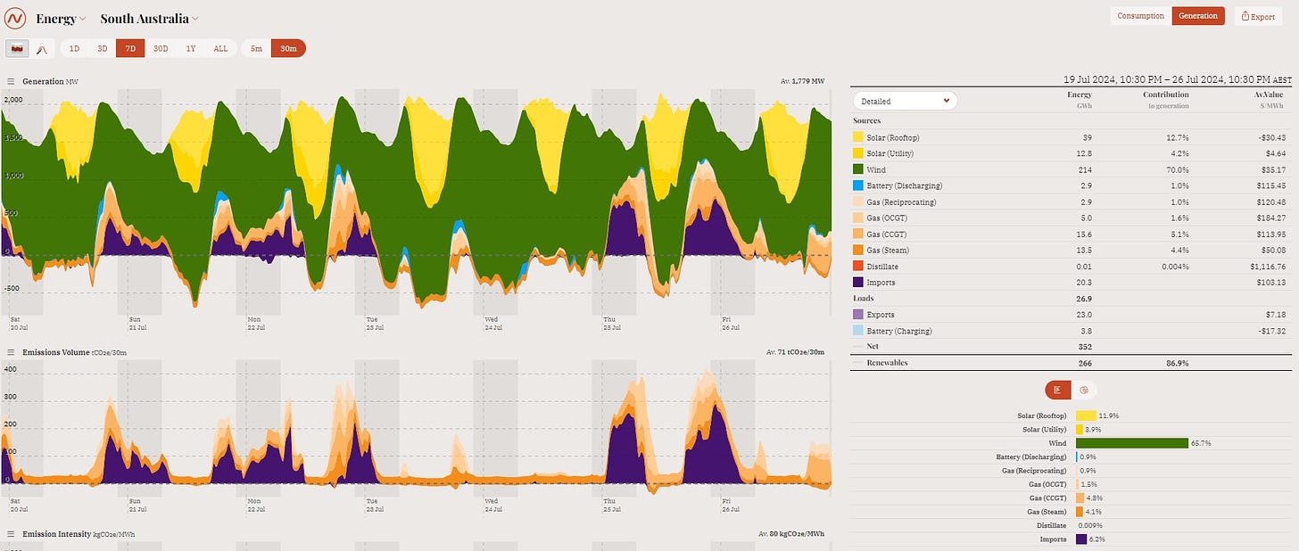
Lots of green (Wind) and yellow (Solar, rooftop and utility). Little orange-brown (gas generation of various types), no red (distillate = diesel I think). Mostly ‘green’ energy, bravo SA! Except, quite a lot of purple imports keeping the lights on when the sun sets (and as we see from Figures 2 those imports are likely generated using fossil fuels). And quite a lot of power export when the sun is shining and the Wind is blowing, with a major expansion of export capacity - to NSW and Victoria - currently underway. Plus, if you look closely, little slivers of pale blue [Battery (Discharging)] at the ends of several days.
I find that form of presentation difficult to fully interpret. Which is why I prefer to download the raw data and then do my own analyses on it.
First, looking at the last ~ year.
Figure 4: South Australia - 374 Days to 25 July 2024:
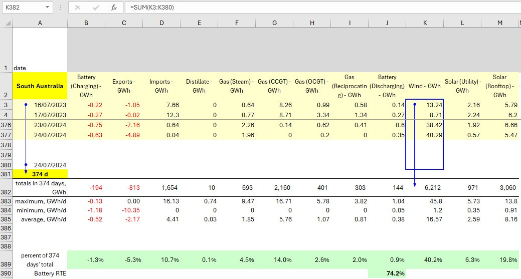
Note: the data is recorded once per day in GWh. In each column of data, the total GWh is the sum of the daily GWh. The ‘percent of 374 days’ total’ %s shaded green are derived from the inferred results, see the table in Figures 5.
Note also that Battery (Discharging) contributed 144 GWh (0.9%) while Battery (Charging) consumed 194 GWh (1.3%), from which we can deduce battery round trip efficiency (RTE) across those 374 days was 74.2%. We can also deduce that batteries in South Australia are currently not going to do the heavy lifting if called upon to support the SA grid through much of a lull at night… possibly contrary to the local ‘conventional wisdom’ on the topic.
Figures 5: South Australia - 374 Days To 25 July 2024, Inferred Results:
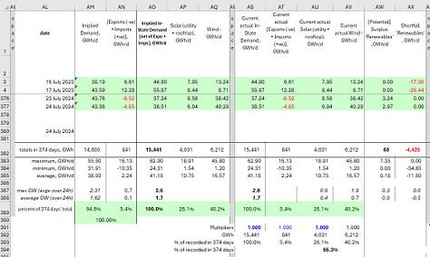
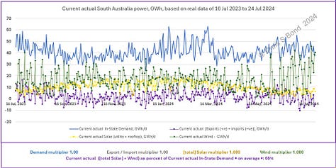
In the table, In-State Demand is the sum of all sources of generation, plus Imports minus Exports. The total in-State Demand was 15,441 GWh across the 374 days included in this data, while the maximum in-State energy Demand was 2.6 GWh/d.4 Wind provided a bit over 6,200 GWh (40%) and Solar 4,030 GWh (26%). Therefore I conclude that, should it wish to continue ‘decarbonising’ its power grid, South Australia should build more *capacity* in those proportions, i.e. Wind 60%, Solar 40%. (After all, Wind has the major advantage that there is a a good chance that it will keep blowing and contributing throughout the night, unlike Solar.)
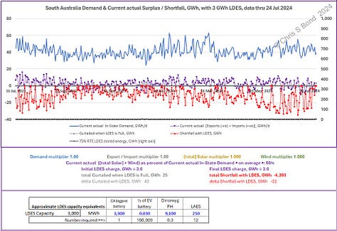
The centre chart in Figures 5 indicates the magnitudes of the Demand, Wind, Solar and Imports/Exports, and how variable they are (albeit every data-point is the average value over that 24-hour interval). The right hand chart shows the near-continuous current Shortfalls (red chart) in ‘renewable’ power generated, summing to 4,393 GWh in this period.
I allowed for a little long duration energy storage (LDES) in the analysis for the right hand chart in Figures 5 because SA does have batteries. How much energy storage currently? According to various search results, not much in the grand scheme of things:
- “South Australia’s Hornsdale big battery”, 04 September 2020. “Now with 150 MW and 193.5 MWh of capacity, the expanded battery…”
- “EnergyAustralia announces plans for 600 MWh big battery in SA”, January 23, 2024. “EnergyAustralia says it will increase the capacity of a battery energy storage system to be built adjacent to its Hallett Power Station in South Australia from an initial 50 MW to 150 MW, and 200 MWh to 600 MWh, after the successful completion of the first stage.” So 200 MWh is already there, and 400 MWh is to be added.
- “A second big battery for South Australia to boost reliability”, 19 March 2024. “The South Australian Government announced the Templers battery alongside local business success story ZEN Energy, which will build, own and operate the 291 MW/h project.”
- “New SA battery storage project approved near Mount Gambier will be three times the size of 'Tesla battery'“, 17 Jul 2024. “The latter battery, colloquially known as the ‘Tesla battery’, can store up to 193 megawatt hours (MWh) and was once the world's biggest. Seven years after it made international news, it's not even the state's biggest. As of August 2023, that title has belonged to AGL's battery at Torrens Island outside Adelaide, which has a capacity of 250MWh.” “Pacific Green says the Limestone Coast Energy Park, which will have a capacity of 1,500 megawatt hours,…”
Hang on a mo… The headline says “three time Tesla battery”, 3 x 193 is approximately 600 MWh, that’s a lot different from 1,500 MWh. Ah, we’ll have to wait until it’s built and operating: “The company expects to begin construction in the fourth quarter of the year, with the first phase of the project to be operational in 2026.”
All those exaggerated claims… don’t tell South Australians about California’s biggest battery to date (Cbbtd: 875 MW, 3,300 MWh), whatever you do!
Anyhow.
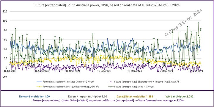
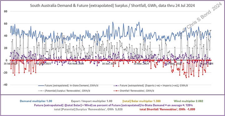
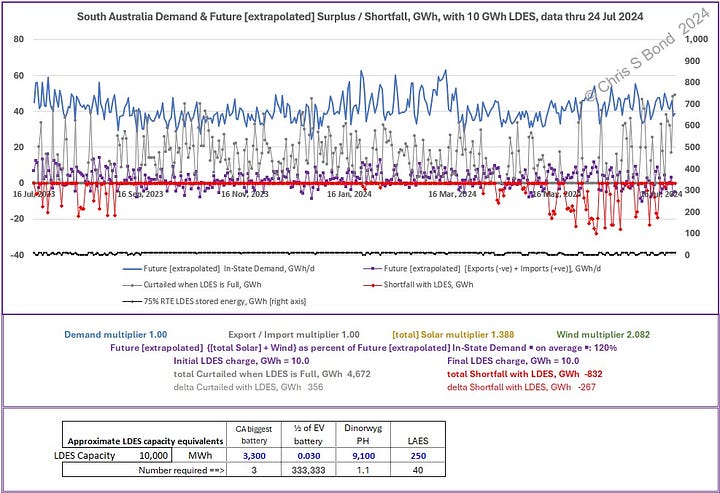
If In-State Demand and interchange are kept constant, we can increase Wind and Solar in 60:40 proportion until we achieve 20% energy surplus overall, which apparently is the optimum. Figures 6 show the numbers and the consequent plots. I’ve allowed LDES capacity of 10 GWh = three times Cbbtd in the analysis, see the bottom right hand plot.
Figures 6: Future South Australia with Unchanged Demand:
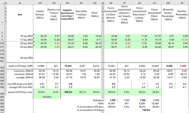
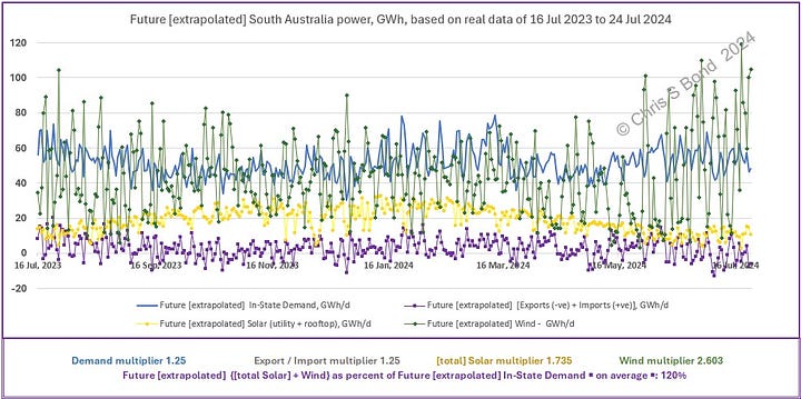
However, we already know that SA is planning for population growth and increased interconnection capacity, and everyone is planning for greater electrification. So I reran the numbers with 1.25 times In-State Demand and 1.25 times Import / Export, then increasing Wind and Solar 60%:40% to achieve 120% overall Surplus: Figures 7. In the bottom right hand plot I’ve allowed for LDES capacity of 33 GWh = ten times Cbbtd to illustrate its potential.
Figures 7: Future South Australia with Increased Demand:

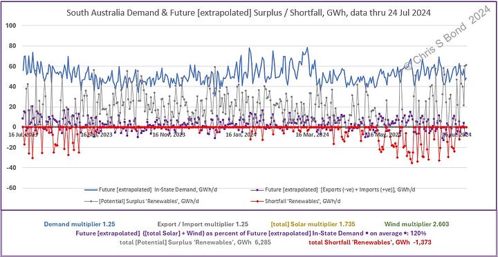
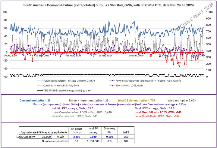
The benefit of having the LDES is that it could reduce SA Curtailment by around 845 GWh while reducing the In-State Shortfall by about 634 GWh. There would still be a Shortfall of around 740 GWh over this timeframe, so some imports of fossil-fuelled generation would still be required to provide it, or SA lights would go out. Note also that the LDES would remain full for a substantial fraction of the year and hence would earn relatively little revenue.
All that is based on daily data, which doesn’t show the fine detail. So I captured 30-minute interval data beginning 16/07/2024 00:30 and ending 27/07/2024 20:30, i.e. 11.833 days’ data, to look in more detail, see Figures 8.
Figures 8: Future South Australia with Increased Demand, 30-Minute Data Resolution [zero LDES], Energy in MW:
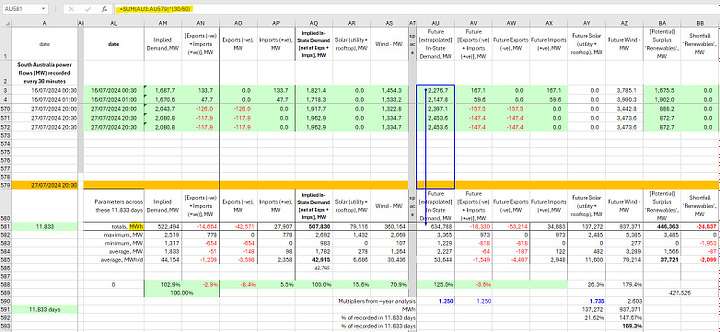
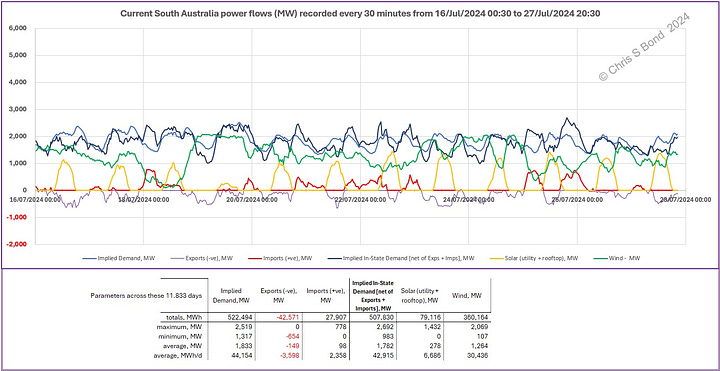
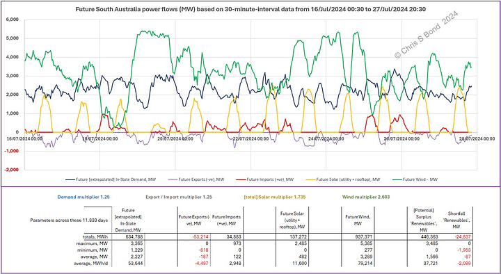
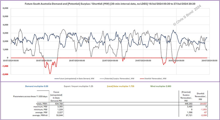
The table in Figures 8 shows the summations and calculations needed to convert the MWs recorded into MWh: the data is recorded every 30 minutes, and so the total of each column is multiplied by 30/60. I used the Wind and Solar multipliers derived from the 374 days’ energy balance. In this windy mid-winter interval this results in a significant overall ‘renewable’ surplus of nearly 170%. However, Solar only provides 26% of that, and plotting the 30-minute data starkly reveals the disappearance of Solar for more than half of every 24 hours, even in sunny South Australia.
Note I fixed the vertical scales of the three charts to allow truer comparison between them.
The Current chart at top right seems to show a period of Wind Curtailment from 19 July to 20 July, and another in the first half of 24 July - the Wind chart flat-lining at about 2,000 MW. Perhaps that indicates local grid constraints.
The Future chart at bottom left shows the very large spikes in Wind generation that would result from increasing Wind *capacity* by the 2.6 multiplier. Obviously the grid constraints would have to be removed to allow that to happen.
The chart at the bottom right displays the [potential] Surplus in grey versus the Shortfalls in red, mainly when the Wind dropped over much of 18 July. Happily for SA it can keep its lights on by importing power when that happens, and similarly it can export when it has a surplus of ‘renewable’ power.
Conclusions
South Australia, congratulations! On average your power generation is roughly two thirds ‘decarbonised’. As you’re undoubtedly aware, to go further while allowing for future electrification and population growth will require substantial increases in grid capacity within the State, and similarly substantial extra interconnection capacity with neighbouring States. It is also likely that you’ll have to accept very substantial levels of power curtailment in the process.
However, from this analysis alone I cannot yet draw conclusions about the ‘decarbonisation’ of the rest of the Australian power grid. That will depend on detailed analysis to show whether ‘decarbonised’ neighbouring States would produce surplus ‘renewable’ power when SA has a Shortfall and vice versa. I hope to start to show some of that in my next post(s).
Copyright © 2024 Chris S Bond
Disclaimer: Opinions expressed are solely my own.
This material is not peer-reviewed.
I am against #GroupThink.
Your feedback via polite factual comments / reasoned arguments welcome.
Someone please direct the Australian NEM to look at and learn from the EIA data: how the datafiles are constructed with a common structure across all US States: all with pre-set chart plots ready for different end-dates to be input: and all with full sets of data going back to ~2018.
This is on the basis that weather systems are wide-area phenomena often affecting adjacent states in similar ways at any one time. Also, hostile states, organisations or individuals may target interconnectors (power or gas) for any number of reasons, and so relying on interconnectors may reduce energy security.
For background: the population of SA was ~1.82 million in 2021 and may rise to 2.33 million (medium scenario) by 2051.
Note I do NOT claim there is anything special about the data from this 374-day interval. It just illustrates some aspects of weather-dependent power generation, without (I am pretty certain) capturing the extremes. I just happened to begin downloading NEM data around 374 days ago.


After watching the wind in Australia for some years I can assure you that South Australia imports coal power from Victoria 18 or 19 nights out of 20. They burn gas all the time and during wind droughts they have to resort to diesel.
The cost of storage is normally under-estimated by a factor in the order of 1000 that is 3 orders of magnitude.
People who pay close attention to the complicated pricing system assure us that South Australia has the highest retail prices in the country and the state is leading the nation in deindustrialization.