

New England Reality
No connection with reality found in a recent NE energy study.

If this post is too long for your email client, please click the graphic at the top of the email to transfer to the Substack post. In any case many of the charts are in ‘gallery view’ i.e. are miniaturised: in Substack you should be able to zoom any chart by clicking on it.
Summary
For this post I reviewed a recent study “The impact of energy storage on the reliability of wind and solar power in New England” by Freeman and Agar. I compared it against the latest three years of NE data from the EIA.
Contrary to the impression given me by the title of the study, I found that currently New England derives barely 5% of its power from Wind plus Solar. In other words there is currently NO reliability of Wind and Solar because together they utterly fail to keep NE lights on, regardless of any energy storage.
If NE were to install ten times current Solar plus 40 times current Wind plus 7 days’ Energy Storage, it would still not reliably keep New England’s lights on.
New England, you are absolutely nowhere near ‘decarbonisation’.
Introduction
Following some discussion of my California Reality analysis, a proponent of all things ‘renewable’ told me of this recent study: “The impact of energy storage on the reliability of wind and solar power in New England” by Freeman and Agar, published online 2024 Mar 9. The context in which I was told of it implied that the person believed this would clinch the argument that ‘renewables’ are the one true answer to all things energy.
Is this true? I inferred from the study title that Wind and Solar power are already significant in New England, and all that’s needed for reliable power is to add energy storage: is that right?
The study uses “44 years of hourly weather data from 1980 to 2023 obtained from the NASA MERRA-2 reanalysis product”, with OUTPUT SPATIAL RESOLUTIONs of 0.5° × 0.625° for both Wind and Solar.1 Etcetera, etcetera. Is that good, adequate, poor?
The study’s main results appear to be presented in its Figure 3:
Study Figure 3: Percent of Time NE’s Lights Stay On vs. Installed *Capacities* of Wind and/or Solar PV with Varying Storage
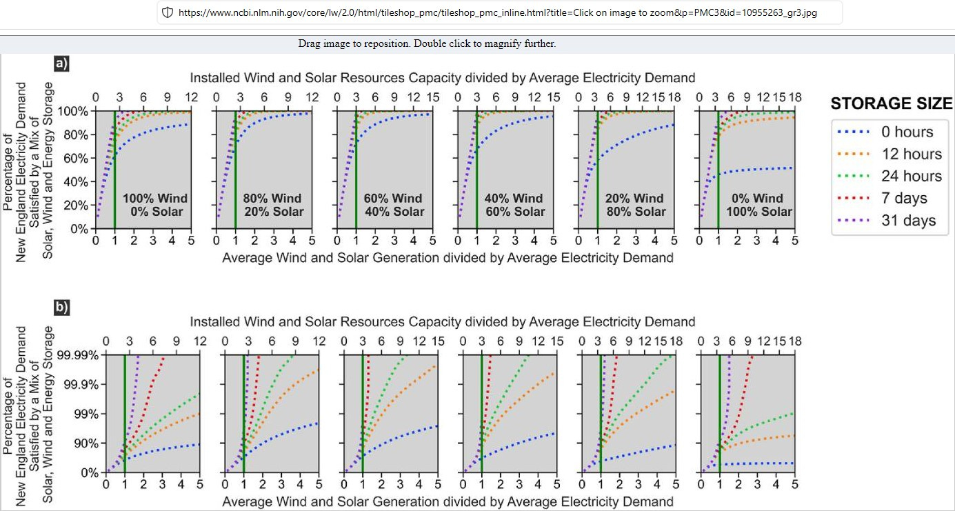
Ignoring the numbers along the bottom axis of each because Supply has to satisfy Demand instantaneously across the grid, i.e. averages don’t keep the lights on. Looking at the bottom set b) of logarithmic plots, the probabilities are best with 80% Wind, 20% Solar on the future NE grid:
- with 24 hours of energy storage (the green dotted line); PLUS
- 9 times ‘average electricity Demand’ of ‘installed Wind and Solar Resources Capacity’
OR
- with 7 days of energy storage (red dotted line); PLUS
- 4 to 4½ times ‘average electricity Demand’ of ‘installed Wind and Solar Resources Capacity’
Either option (according to the Freeman and Agar study’s modelling) *should* keep the lights on 99.99% of the time.
The study makes some mighty claims:
“While the research retains its foundational focus on New England, the ripples of its implications reverberate broadly. By focusing on the unique blend of renewables and grid challenges in New England, which serves as a microcosm of the broader global energy transition, we uncover insights that extend far beyond this region alone and can be transferable to similar regions worldwide, offering valuable guidance on managing high renewable energy penetration and variability. The parallels between New England and other regions facing comparable challenges underscore the universal relevance of our findings. Moreover, our research aligns with the overarching goals of sustainability and grid stability, making it pertinent to the global energy discourse. The alignment of our results with larger-scale studies underscores the robustness and generalizability of these conclusions.”
The study *did* made use of the EIA – U.S. Energy Information Administration data on Massachusetts (only MA… not all New England?) but then “employed a 9-year hour-by-hour average (2015–2023) to represent the hourly demand for a single year. This approach aimed to enhance the robustness of our analysis by looping this averaged demand over the 44-year period, effectively mitigating small variations in demand from year to year.”
So, not 44 years of data, but 9 years, repeated.
Searches for “valid” or “real” or “compare” in the Freeman and Agar study revealed no cross-checking or validation of the NE model against real recorded data. But at reference [40] we find “M.Z. Jacobson, M.A. Delucchi, M.A. Cameron, B.A. Frew, Low-cost solution to the grid reliability problem with 100% penetration of intermittent wind, water, and solar for all purposes, Proc. Natl. Acad. Sci. U.S.A. 112 (49) (2015)”. Ah, that explains a lot: the Freeman and Agar study is comparing itself to studies by the Professor who wants us all to “be more Albania”.
Because I’m strongly in favour of maintaining solid connections to reality, I decided to do some reality checks on the study’s numbers.
For this post I again returned to the EIA’s excellent data source, downloading file “Region_NE.xlsx” on June 15, 2024. I also downloaded “ISNE.xlsx”, a file about 2½ times as large, but I cannot see any material differences in the data (see Figures 1) so I have adapted the “Region_NE.xlsx” for the further analysis.
Figures 1: Region_NE vs. ISNE Top Five Daily Charts:


Similarly to what I did for California, Texas and Germany, here I focus on the latest 3 complete years of NE data:
Figures 2: EIA 2021-22, 2022-23, 2023-24 Daily Charts:


Efforts to ‘decarbonise’ a power grid need to focus on replacing carbon-intensive forms of generation with low- or no-carbon forms.
- New England currently has significant quantities of power generation from Nuclear and Hydro. My analysis keeps these as-is;
- Interchange with neighbouring grids is significant. My analysis nets off the interchanged power so as to ensure future NE has energy independence and to make sure future NE doesn’t import dirty dirty fossil energy from surrounding states;
- This leaves the carbon-fuelled generation to be eliminated / displaced
Where is NE currently according to the EIA data? See Figures 3.
Figures 3: 2021-22, 2022-23, 2023-24 Actual NE Demand, Wind & Solar:


Note the yawning chasm between Demand (black) and [Wind (green) + Solar (yellow)] every year. The large multiple of *capacity* required of those ‘renewables’ in the Freeman and Agar study begins to make more sense (the study’s title makes no sense).
Also note the overall energy balances in each of those three whole actual years:
2021-22 NE in-zone Demand was satisfied by 95.7% fossil sources:
total MWh Demand: 103,066,408 (Avge. Demand, MWh/d = 282,374)
total MWh Wind: 3,767,577
total MWh Solar PV: 618,107
Nominal annual shortfall of ‘renewables’ (-ve) MWh: -98,680,724
2022-23 NE in-zone Demand was satisfied by 95.4% fossil sources:
total MWh Demand: 96,637,632 (Avge. Demand, MWh/d = 264,761)
total MWh Wind: 3,544,280
total MWh Solar PV: 928,523
Nominal annual shortfall of ‘renewables’ (-ve) MWh: -92,164,829
2023-24 NE in-zone Demand was satisfied by 95.4% fossil sources:
total MWh Demand: 93,521,407 (Avge. Demand, MWh/d = 256,223)
total MWh Wind: 3,369,507
total MWh Solar PV: 942,643
Nominal annual shortfall of ‘renewables’ (-ve) MWh: -89,209,257
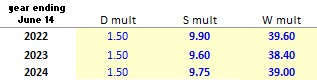
To see what the future might hold for New England, I allowed for electrification of everything that can be electrified by allowing Demand to increase by 1.5 times (i.e. D mult in Table 1). That is, each current hourly recorded value of Demand is increased by that factor. To then achieve energy balances over each full year, by trial and error I extrapolated each current hourly recorded Solar value (i.e. multiplied by S mult) and each current hourly recorded Wind value (i.e. multiplied by W mult). The factors I found that achieved this are shown in Table 1. (I followed the Freeman and Agar study inasmuch as W mult = 4 times S mult in each year.)
Table 1: Wind & Solar Factors for Annual Energy Balances:
Ten times current Solar
PLUS
40 times current Wind.
To see what that looks like, see Figures 4.
Figures 4: Future NE Demand, Wind & Solar based on actual weather-dependent generation 2021-22, 2022-23, 2023-24:


If I was a resident in New England and I saw those charts… Wind power peaks roughly 1½ times maximum future Demand… Just how much grid reinforcement would be required to support all that?
Anyway, to continue.
If New England added 7 days of grid long duration energy storage (LDES) per the Freeman and Agar study, that would be sure to keep the lights on across the zone, wouldn’t it?
My methodology as plotted in Figures 5 only credits LDES with power to ‘charge up’ when there is surplus ‘green’ power. This logic is summarised in Table 2:
Table 2: ‘Green’ LDES Logic:
1 IF there is surplus [future Wind + future Solar]
2 AND there is unused energy storage capacity in future LDES
3 THEN that future LDES can be scheduled to receive and store ‘green’ energy (thereby reducing the amount of energy that has to be curtailed)
4 UNTIL (at maximum) the future LDES becomes ‘full’
SO
5 WHEN there is a shortfall of [future Wind + future Solar]
6 AND there is ‘charged-up’ future ‘green’ LDES
7 THEN we could get back up to 70% [1] of the energy stored in the LDES (thereby
reducing the shortfall of energy) by scheduling the LDES as additional generation
8 UNTIL (at minimum) the LDES becomes ‘empty’ [2]
[1] based on assumed average round-trip efficiency (RTE) of a mixture of pumped hydro storage, battery storage, and other technologies yet to be invented;
[2] The operating range of LDES needs to remain within constraints on e.g. depth of discharge (DOD) which will probably depend on its technology. I’ll work with net storage capacity and assume we remain within such constraints, whatever the technology mix.
I assume no limits on charge / discharge cycles or other aspects of LDES operation: if there is capacity to be charged, or stored ‘green’ energy to be discharged, then my analysis uses it.
Of course no power grid can separate ‘green’ from other colour electrons. Table 2 logic defines the energy accounting / grid operator capacity dispatching controls necessary to ensure ‘green’ power remains clear ‘green’. The economic incentives to muddy the greenness will be immense.
Figures 5: Future NE Demand, Wind & Solar based on actual weather-dependent generation 2021-22, 2022-23, 2023-24, PLUS 7 x Average Demand Capacity of LDES Each Year:


There you have it, folks of New England. All the red parts of the chart show when the lights would have gone out based on those three years of real data and
ten times current Solar
PLUS
40 times current Wind
PLUS
7 days’ Energy Storage
ALL THAT STILL DOESN’T KEEP YOUR LIGHTS ON
By the way, 7 days of energy storage used with the 2023-24 data is 2,964,924 MWh =
~ 900 times California’s biggest battery to date; or
~ 100 million EVs with half their 60 kWh capacity dedicated to support of the NE grid;
or over 300 times the Dinorwyg pumped hydro facility in Wales2, UK; or
~ 12,000 of the 250 MWh liquid air energy storage (LAES) facilities being trialled
or any combination / permutation of those and other LDES technologies yet to be commercialised.
There’s a saying: “Excrementum vincit cerebellum”. The Freeman and Agar study referenced herein is both disconnected from reality and is so opaquely written that it appears to have completely baffled the ‘renewables’ proponent I mentioned at the start.
Conclusions
Ten times current Solar plus 40 times current Wind plus 7 days’ Energy Storage still does not keep New England’s lights on.
New England, you are absolutely nowhere near ‘decarbonisation’.
Copyright © 2024 Chris S Bond
Disclaimer: Opinions expressed are solely my own.
This material is not peer-reviewed.
I am against #GroupThink.
Your feedback via polite factual comments / reasoned arguments welcome.
The Earth’s circumference is a tad over 40,000 km (just under 25,000 miles). So the grid has sides approximately 0.5/360 = 55.6 km (~35 miles) by .625/360 = 69.4 km (~43 miles)
The link mentions a visitor centre at ‘Electric Mountain’ but I’ve seen reference to that having been closed. Check before you travel!
Great article. As a former state senator I can tell you that I don't know a single Democrat legislator who understands this but they are pushing disastrous energy policies that will make electricity far more expensive and far less reliable. They are blaming the Millstone deal for the big jump in electricity costs in July, 2024. But the standard offer rate from Eversource is 8.9 cents per kWh while the Millstone deal is 4.99 cents per kWh. Only a politician could claim that those numbers show Millstone is contributing to the big increase in electricity costs. There's more to be explained that I don't have time for in this post. Keep up the good work Chris B.
So what is the policy implication? DO more? DO less? DO different? And who should DO it?