

One Year in Australia's NEM
What the numbers show now; and what simple extrapolations of the numbers show may be expected from Australia's reliance on Wind + Solar for future power generation.

Background
See my Eastern Australia Progress post for background, including on Australia's National Energy Market (the NEM) which operates the grid across Eastern Australia. That vast area comprises five States (New South Wales, Queensland, South Australia, Victoria, and Tasmania) plus the Australian Capital Territory.
See also, my critique of David Osmond’s weekly posts where he shows the results of running what he claims is “ a simulation of Australia’s main electricity grid using rescaled generation data to show that it can get very close to 100% renewable electricity with 24GW/120GWh of storage (5 hrs at av demand)”. Any energy system “simulation” like his, that substitutes 3-year-average squiggle-woo for a granular analysis of energy flows, isn’t going to show whether the lights would stay on or not.
Why
I’m not obsessed with Australia’s power generation despite any appearance to the contrary. It’s just that the Aussie continent is providing another real-life study into how practicable is a transition to mostly Wind plus Solar power generation in a wealthy industrialised society. Will it be enough to keep the lights on, and at what cost? Are there lessons to be learned from the Spain + Portugal blackout of 28 April 2025?1
Here in the UK over the last two decades or so, the similar drive to ‘decarbonise’ our power grid has been the be-all and end-all of Great British energy policy. Over the same timescale we, the home of the Industrial Revolution, have largely de-industrialised.
The policy of adding more and more Wind + Solar generation *capacity* also leads to Diminishing Returns, absent immense capacity of ultra-cheap electrical energy storage - which is yet to be developed at anywhere near adequate scale.
Is Australia dooming itself to follow the same path as the UK? Agreed, it is a *much* sunnier region than the UK… but so is Spain. Australia’s lights will still go out if it gets its energy policy wrong. And in the global context - see Figure 0 - would it make a material difference if Aus *did* ‘decarbonise’?
Figure 0: The Global Context of Carbon Emissions:

How
I’ve detailed my methodology in Appendix 1 below. It is all just simple arithmetic.
Current Status of the NEM
We can get an indication of the scale of Australia’s ‘decarbonisation’ problem from a one-year view taken from the Open Electricity website, see Figure 1.
Figure 1: The Current NEM Generation Mix for 1 Year:
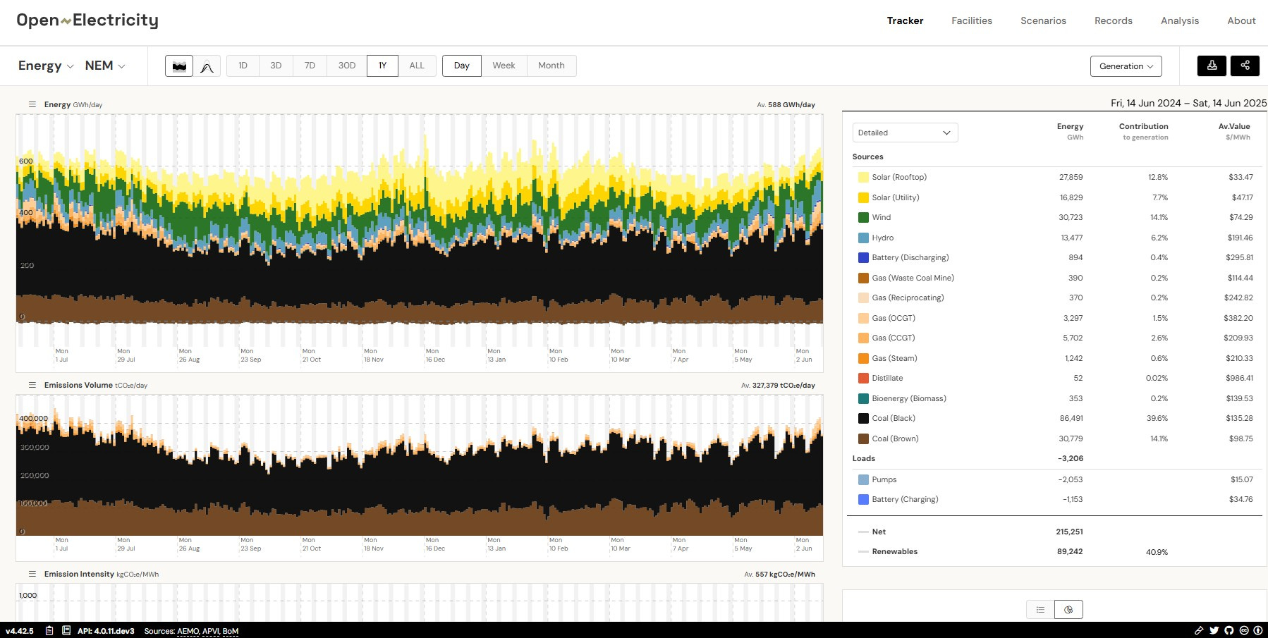
Eastern Australia burns *a lot* of coal in a year; and the highest levels of coal consumption occur May - August i.e. in Australia’s winter months when Solar generation is lower.
Australia produces quite a lot of natural gas, but is liquefying and selling much of it to the rest of the world, leaving itself short of that flexible fuel. Meantime, Aus is going all-in on Wind plus Solar to bring its CO2 emissions down.
½-Hour Resolution Data
The granular NEM data2 I’ve collected begins 13 June 2024 00:00 and ends a full year later: from winter through an Aussie summer and back into winter. I have no idea how typical this year’s weather has been: this is the data I’ve got.
Figures 2: Real Power Flows, Five NEM States, 1 Year thru 14 June 2025:


In Figures 2, for each State I have plotted:
- the calculated in-State Demand (purple);
- recorded Solar (Rooftop plus Utility) (orange/yellow);
- recorded Wind (green);
- recorded Hydro (blue); and
- the calculated [fossil-free] Shortfall (red).
The vertical scale is the same for all: maximum 16,000 MW [set by NSW]; minimum -12,000 MW [to capture the worst-case in-State Shortfalls].
Plotting all States on the same scale clearly shows the relatively small magnitudes of South Australia’s and Tasmania’s power systems in the context of the whole NEM.
[Reminder: for my methodology see Appendix 1.]
Figures 3: The Five NEM States - Combined Generation and Shortfalls:


You will note in the right hand image in Figures 3:
- my calculated total Demand for the year is a little over 215,266,000 MWh = 215.266 TWh. The NEM year in Figure 0 shows Net Energy 215.251 TWh. That’s very good agreement and a good reality check;
- the summation of [total Wind] + [total Solar] + [total Hydro] + [-total {fossil-free} Shortfall] = 30.425 + 44.644 + 13.536 - (-125.661) = 215.266 TWh; again, a good check on my arithmetic.
This year of real data demonstrates how false is the belief that, across a land area as huge as Eastern Australia, there would never be times when there’s not enough Wind + Solar + Hydro together to keep the lights on. Every night, of course, Solar drops to zero; and that quite often coincides with Wind collectively falling across the region. Hydro output can be controlled to sometimes fill the gaps, but in drought-prone Aus, Hydro is a finite resource. And, of course, any pumped hydro energy storage in the system doesn’t generate extra electricity, it usefully time-shifts it while consuming round-trip efficiency losses.
Looking at the overall energy balance as revealed by this year’s numbers:
- combined Demand averaged 24,466 MW (max ~39,317 min ~17,063 MW);
- combined Wind averaged 3,458 MW (max 9,192 min 104 MW);
- combined Solar averaged 5,074 MW (max 21,419 min 0 MW *every* night);
- combined Hydro averaged 1,538 MW (max 6,410 min 190 MW).
These leave the fossil-free Shortfalls as follows:
- combined Shortfall averaged -14,396 MW (best -5,374 MW worst -26,351 MW)
For a **very preliminary indication** of how much more Solar + Wind *capacity* might be needed just to satisfy the average Demand of ~24,500 MW, the energy balance using the above average numbers gives:
three times average current Solar + Wind = ~ 3 x (5,074 MW + 3,458 MW) ~ 25,600 MW
Of course, averages don’t keep the lights on. So Australia will need a lot more than three times current Solar + Wind *capacity*, plus all the extra grid, transformers, etc. etc. … and that’s before accommodating future increased electrical power consumption as electrification takes place.
Magnitude of Storage Required to Moderate Solar
The extreme variations in Solar generation drive the extreme spikiness of the Shortfall chart. The extreme peaks in Solar generation also drive substantial and increasing levels of curtailment to allow control of grid frequency within the required tight tolerances. [Noting that curtailment can also be driven by local grid capacity etc. constraints, but the ultimate limit is Demand in that time interval.] The daily Solar ‘surge’ occurs over a 24-hour timescale and so, just in terms of that duration limit, Solar *should* be ‘easiest’ to moderate using electrical energy storage.
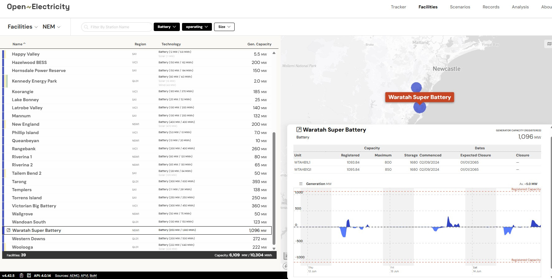
The NEM has begun this effort: at the time of writing it lists 39 “operating” battery energy storage system (BESS) facilities with total capacities 6,109 MW / 10,304 MWh - see Figure 4 below. [However, NEM’s definition of “operating” is too flexible: the largest - Waratah - is still barely doing anything3 six months after it first appeared on this list]
Figure 4: “Operating” Battery Energy Storage Systems on the NEM:
How big is the problem for the five States of the NEM? Let’s begin to see.
Figure 5: The Five NEM States - Summer Solar Generation Profiles:
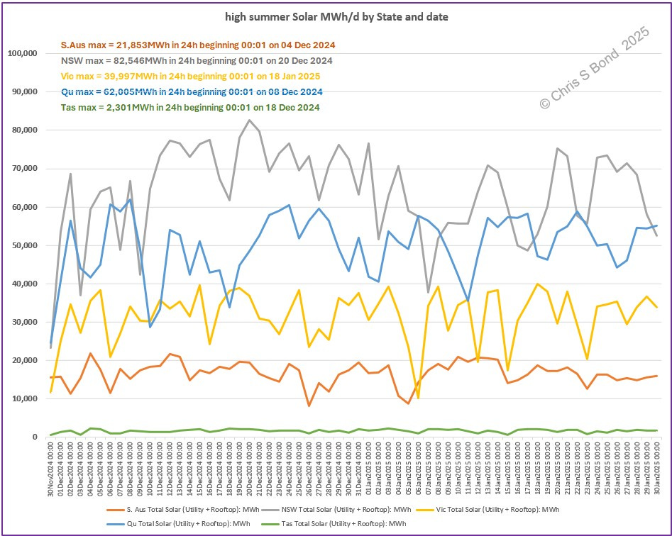
High summer Solar MWh/d by State and date:
- S.Aus max = 21,853 MWh in 24h beginning 00:01 on 04 Dec 2024
- NSW max = 82,546 MWh in 24h beginning 00:01 on 20 Dec 2024
- Vic max = 39,997 MWh in 24h beginning 00:01 on 18 Jan 2025
- Qld max = 62,005 MWh in 24h beginning 00:01 on 08 Dec 2024
- Tas max = 2,301 MWh in 24h beginning 00:01 on 18 Dec 2024
For each State we can then find the MWh capacity of BESS required to smooth that maximum day’s Solar generation across that 24 hours as shown in Figures 6:
Figures 6: Moderating Solar for each NEM State Individually:


Summarising the results:
- NSW BESS ~50,000 MWh ~ 30 x Waratahs ~ AUD 30 billion,
for an average 3,439 MW smoothed power across that day.
- Vic BESS ~24,600 MWh ~ 15 x Waratahs ~ AUD 15 billion,
for an average 1,667 MW smoothed power across that day.
- Qld BESS ~39,250 MWh ~ 23 x Waratahs ~ AUD 23 billion,
for an average 2,584 MW smoothed power across that day.
- S.Aus BESS ~13,700 MWh ~ 8 x Waratahs ~ AUD 8 billion,
for an average 911 MW smoothed power across that day.
- Tas BESS ~1,400 MWh ~ 0.8 x Waratahs ~ AUD 0.8 billion,
for an average 96 MW smoothed power across that day.
Always remembering that you get back less energy from a BESS: they are not ‘electricity generators’, they are ‘electricity time-shifters’ with losses.
And remembering that these are for current recorded rates of Solar generation. In the future, whatever the multiple of Solar *capacity* gets installed, those BESS capacities and costs will need to be multiplied by the same factor(s).
Note I’m not claiming the above would represent the best use of BESS capacity. They simply illustrate the magnitude of BESS capacity required to smooth each peak day’s Solar in each of the NEM States.
Figure 7: Alternatively, Moderating Solar for the Combined NEM States:
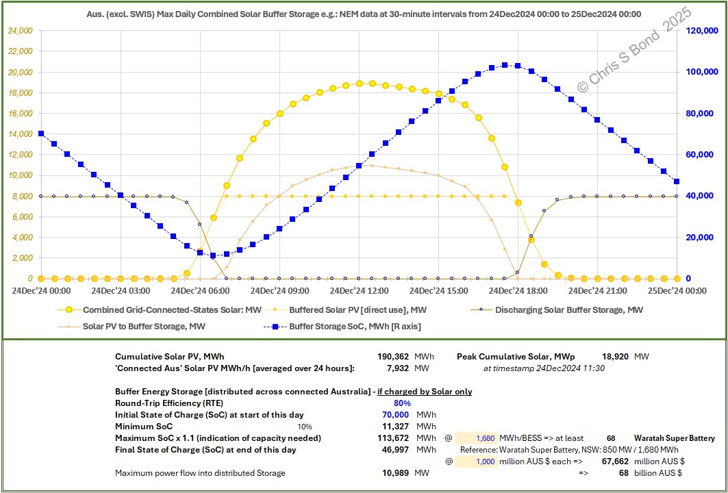
If we assume that the interconnection capacities between the five NEM States are without limits (unrealistic), then if they pooled their BESS capacities to smooth the maximum combined Solar from the peak day of summer 2024 - 24 December 2025 - then the total BESS capacity would ‘only’ be ~114,000 MWh ~ 68 x Waratahs
~ AUD 68 billion, for an average 7,932 MW smoothed power across that day.
Extrapolating Into the Possible Future
I’ve outlined my methodology in Appendix 1 at the bottom of this post.
The main parameters for a future ‘decarbonised’ NEM (assuming we have to continue to rule out carbon-light nuclear generation) are:
- future multiple of Wind;
- future multiple of [total Solar];
- future multiple of Hydro;
- future capacity of electrical energy storage (whether BESS, pumped hydro or other yet to be commercialised at scale)
What measure should we use to judge ‘success’? There are multiple variables and consequently too many possible outcomes to do anything more than illustrate the issues.
But first, eliminate one potential variable: assume future Demand will be higher.
Allow future Demand across the NEM to increase by a factor 1.5
to allow for increases in population, electrification of everything, and to try to ensure that power is sufficiently plentiful so as to prevent de-industrialisation.
I leave the financial modelling of the following scenarios to others, except to say I would expect a transparent discussion of *all* the costs versus benefits of any options.
I assume zero increase in Hydro across drought-prone Australia.
For each scenario below, I assume a repeat of the last year’s weather-dependent generation profiles. Of course, weather being weather, this might have been more or less benign than is typical, and almost certainly was not as adverse as a reasonable worst-case might be. That’s the thing about critical energy systems: they need to be designed to achieve ‘good’ performance whatever the weather brings.
Example Scenario 1: 120,000 MWh LDES, Lights on 80% of the Time:
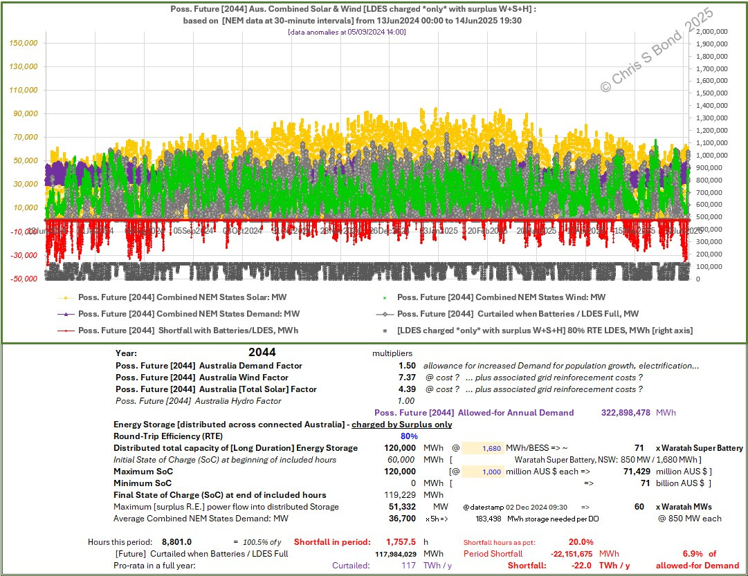
The NEM could keep the lights on for 80% of the ½-hour intervals if there were in future:
120,000 MWh of electrical energy storage; and
7.4 times current Wind; and
4.4 times current [total] Solar.
To maintain grid stability, 118 TWh of power cumulatively surplus to Demand across all the ½-hour intervals would have to be curtailed.
This scenario requires just over 22 TWh of dispatchable [fossil] power generation, which is nearly 7% of the year’s cumulative Demand.
Example Scenario 2: 240,000 MWh LDES, Lights on 80% of the Time:

The NEM could keep the lights on for 80% of the ½-hour intervals if there were in future:
240,000 MWh of electrical energy storage; and
6.4 times current Wind; and
3.8 times current [total] Solar.
To maintain grid stability, 51 TWh of power cumulatively surplus to Demand across all the ½-hour intervals would have to be curtailed.
This scenario requires just over 25 TWh of dispatchable [fossil] power generation, which is nearly 8% of the year’s cumulative Demand.
Example Scenario 3: 60,000 MWh LDES, Lights on 90% of the Time:
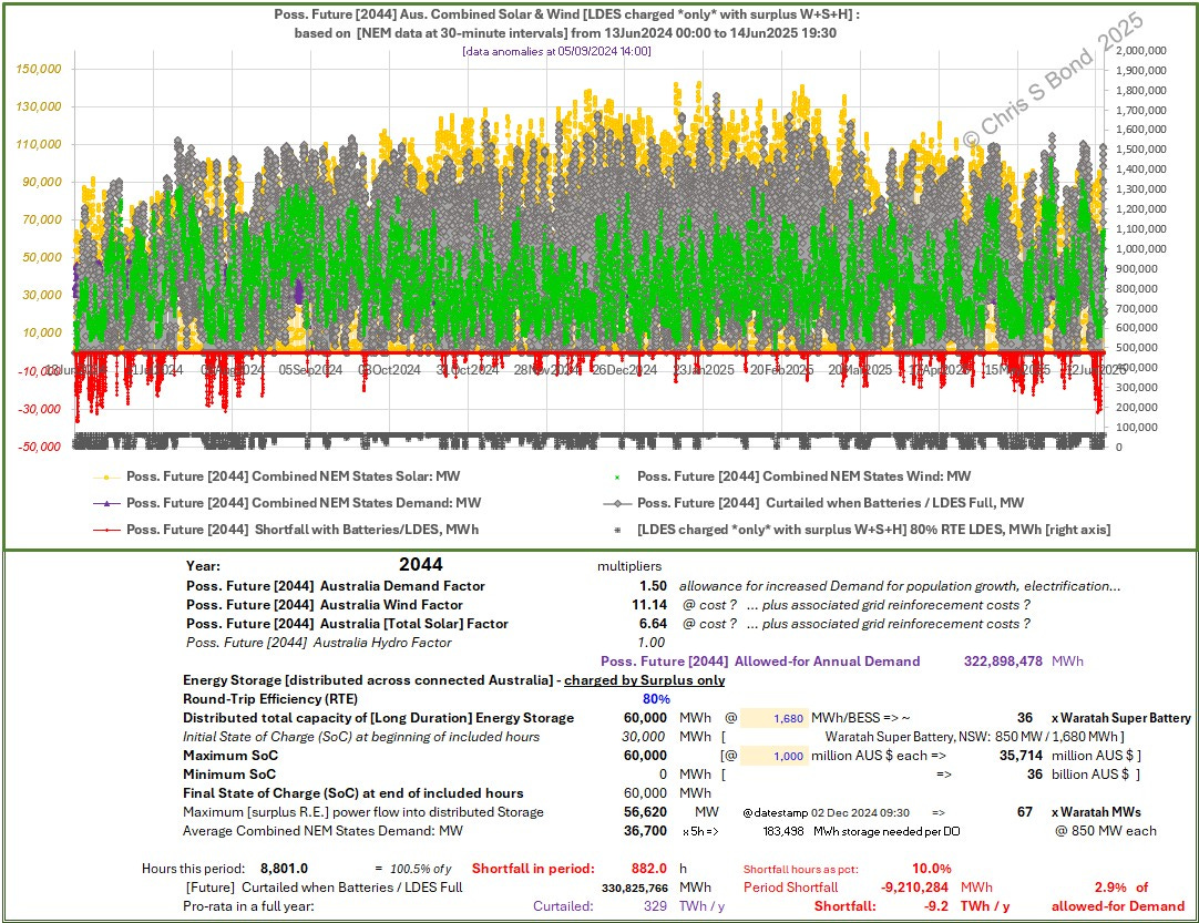
The NEM could keep the lights on for 90% of the ½-hour intervals if there were in future:
60,000 MWh of electrical energy storage; and
11.0 times current Wind; and
6.6 times current [total] Solar…
But, to cope with the maximum surplus RE power flow into storage of over 56,600 MW this scenario would require the power capacity of about 25 times Snowy 2.0… but assuming sufficient LDES power capacity was made available,
to maintain grid stability, over 330 TWh of power cumulatively surplus to Demand across all the ½-hour intervals would have to be curtailed.
Meanwhile this scenario requires just over 9 TWh of dispatchable [fossil] power generation, or nearly 3% of the year’s cumulative Demand.
And so on: a near-limitless number of permutations can be postulated.
Note that a scenario achieving ‘keeping the lights on’ 80% of the time, equates to having over 40,000 MW of total capacity of dispatchable sources of power available to surge into action 20% of the hours ~ 1,760 hours in a year. Sometimes for just a few hours, sometimes for days. Sometimes hardly ticking over, occasionally all going flat out.
Similarly for the ‘keeping the lights on’ 90% of the time scenarios, except the near 40,000 MW of total capacity of dispatchable sources of power will only be called on ~880 hours per year, with similar huge variations in the rates they’ll need to be run at.
That ‘keeping the lights on’ power is society-critical. If that critical power is to be delivered when it’s needed, all that [ageing, unwanted but essential] fossil-fuelled generation capacity will have to manned, inspected, maintained, paid for… somehow.
Conclusions
Considering the huge quantities of minerals [pdf] that are required for 100% ‘renewable’ power generation4 I think we’re duty-bound to moderate our ambitions for ‘decarbonisation’ to a practicable level.
Whether the large multiples of Wind and Solar plus energy storage I outline above for the future NEM are ‘practicable’, only Australians can judge.
Appendix 1: Methodology
The NEM records data for the whole of the NEM, and also separately for the States within the NEM. The States have some power interconnections and routinely exchange power, and the NEM is planning to increase interconnection capacities.
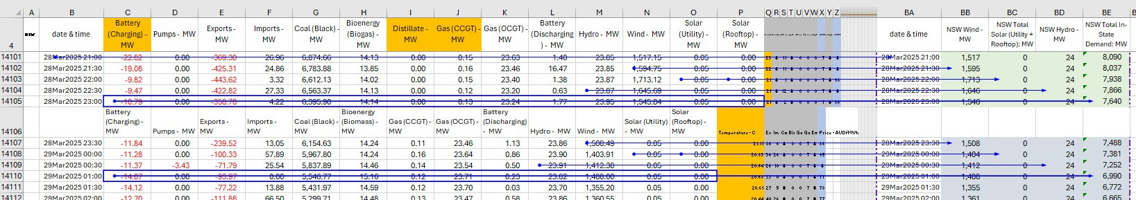
At the whole-NEM level, interconnector power flows are opaque: download a set of NEM data and no inter-State power flows are reported, as you can see in the example week’s data below:
At the State level, however, interconnector power flows are reported. I have more confidence when I can see the data, and anyway I’m interested in progress at the State level, hence I perform energy balances State-by-State for each ½-hour interval. I then combine those individual State results arithmetically using the NEM time-stamps to keep the energy quantities in sync.
For the extrapolations to future-Australia I ignore grid limits. I’m very aware that grid power capacities are limited, but what I’m trying to do with my extrapolations is illustrate the *magnitudes* of the power flows as ‘electrification’ ramps up. Then readers can produce their own back-of-envelope costings for such grid expansions.
Similarly, I am agnostic as to how a multiple of Wind or of Solar should be delivered in the future. By that I mean the location, types, dimensions, nominal design *capacities* etc. etc. of all the additional hardware, are all irrelevant details to my analysis. I don’t care exactly how a Wind multiple of W or a Solar multiple of S is delivered. But I am certain that the details will heavily influence the costs. Again, once they know the multiples needed, readers can produce their own back-of-envelope costings for them.
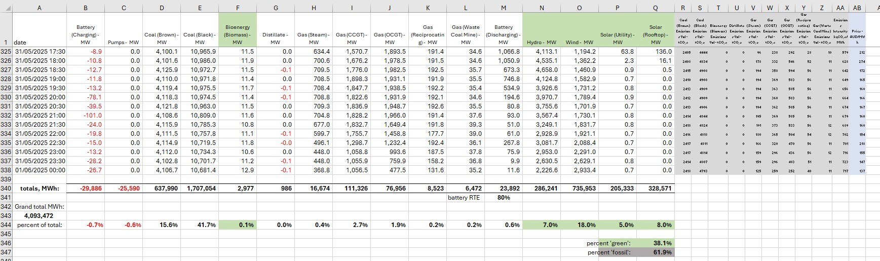
a) NEM data for each State:
My workbook comprises several tabs: one for each NEM State, one for collected data, one for charts, etc.
Example data for NSW:
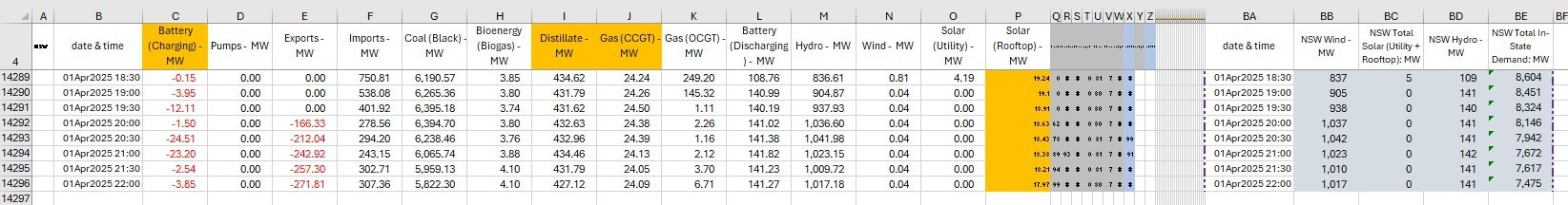
Example calculations for NSW:
Example Collection calculations for NSW:
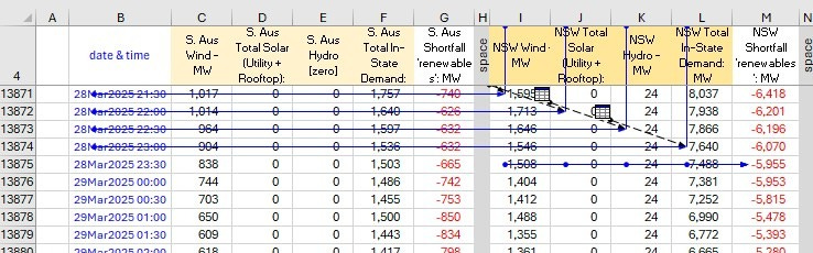
The [fossil-free] Shortfall in a given interval =
Wind + total Solar + Hydro - [in-State Demand]
The only fossil-free energy source I omit is ‘Bioenergy (Biogas)’, which features only in the data of NSW and Queensland. A quick check reveals the contributions are minimal, typically less than 1%, i.e. are not going to materially change my analysis.
The sets of collected records and derived Demands and Shortfalls are the source of the plots for each State I show in Figures 2. At the bottom of each range of my Excel file are the calculations of Minimum, Maximum and Average of each parameter that are reflected onto the bottom area of each chart. These were complicated by a few NEM data anomalies at around 05/09/2024 14:00 which affected all the States - so my formulae do not include those few rows of anomalous values.
b) Extrapolated energy flows and energy balances for each State:
I designed the layout of the workbook to fully preserve the original data as described above, while allowing extrapolation using simple multiples in a different area of the ¦collected¦ tab.
Example future (extrapolated) calculations for NSW:


The same multipliers are used on each State’s data for each timestamp. As can be seen in the right image, as that day advances past noon the [fossil-free] Shortfall switches from -ve to +ve then back to -ve in NSW, and similarly but differently in South Australia.
Example future (extrapolated) calculations for the combined NEM States:

It’s all simple arithmetic. Each State’s recorded Wind or [total] Solar or Hydro times the relevant multiplier. The result compared to the multiplied Demand giving that interval’s Shortfall. All the Winds added together; all the [total] Solars added together; vs. all the Shortfalls added together.
Of course future reality would not be that simple: I have not tried to include for curtailment, I have not tried to account for grid limits, etc. My intent is simply to see how big the simple numbers get, and whether, having simply summed the numbers, the NEM’s lights stay on.
Example future (extrapolated) calculations for the combined NEM States - LDES:
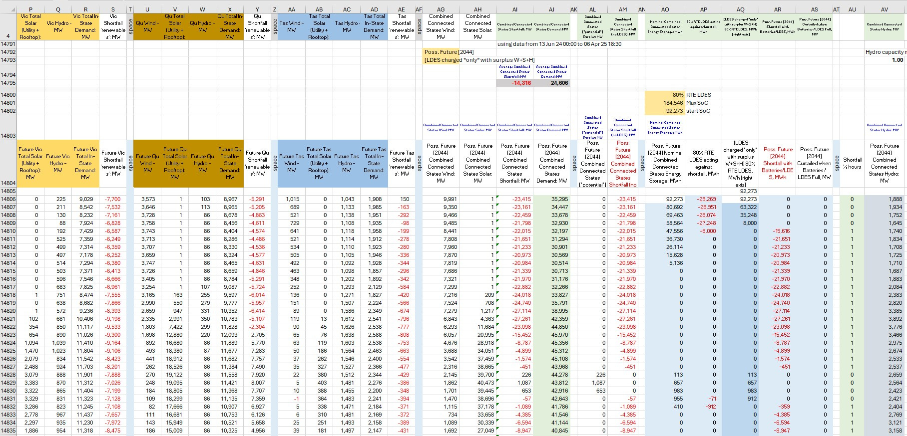
Continuing scrolling to the right, we can see the rest of the calculations.
- the combined States future Demand
- the combined future Shortfall or surplus
- the long duration energy storage (LDES) calculations
[which assume the LDES begins at 50% charge to counter earliest Shortfalls]
- the LDES charging or discharging
[which assumes only surplus Wind + Solar electricity is used]
- curtailment required if the LDES has filled up, to maintain grid balance
- a counter for the number of ½-hour intervals of Shortfall despite the action of LDES
- a tally of total combined Hydro
[various commenters have said that more hydro is unlikely in low-rainfall Aus]
Always remembering that energy storage does not *produce* electricity, it only time-shifts it. The real-world mainly-battery round-trip efficiency (RTE) I’ve used in these calculations seems (from NEM data) to be around 80%. That energy loss is an overall drain on the system, but may be tolerable because it can shift energy from times of over-supply = curtailment, to when it’s needed.
End of Appendix 1.
Copyright © 2025 Chris S Bond
Disclaimer: Opinions expressed are solely my own.
This material is not peer-reviewed.
I am against #GroupThink.
Your feedback via polite factual comments / reasoned arguments directly relevant to the material in this post, are welcome.
The Iberian Peninsula blackout happened over a month ago, yet no definitive ‘root cause’ of the failure has yet appeared. Indicative, I feel, of how much of an ideological / political hot potato this failure is. At least it has woken people up to some of the risks of loss of power: even in spring in Spain it resulted in deaths and injuries, as well as huge economic loss.
In the meantime, it’s been reported that Spain’s grid operator has set minimum requirements for generators providing inertia... which might be interpreted as an admission that low inertia contributed to the cascade of failure. A European expert investigation [pdf] has been initiated.
I’ve complained before that the quality i.e. resolution of the data available from the NEM is p*ss-poor: records for the past year are only at daily, weekly or monthly resolution.
You can tell little about whether your power grid will keep the lights on every minute of a day from power supply averaged over a day: it’s even worse with weekly or monthly resolution data.
Adequate granular-resolution data is only available from the NEM 7 days at a time.
[In this respect, it’s *almost* as if the NEM is trying to make it difficult for third parties like me to collect sufficient data to question the NEM’s official line that ‘decarbonisation’ is going swimmingly. But maybe that’s just my paranoia.]
Below you can see examples of the [poor] NEM data options:


Ah, Waratah: this probably explains it.
“Estimation of the quantity of metals to phase out fossil fuels in a full system replacement, compared to mineral resources” by Simon P. Michaux: Bulletin 416 from Geological Survey of Finland. See for example the chart on page 228 [reproduced below] and the charts on pages 229-230.
I think a pragmatic approach with current technology might land at a solution with somewhere between 6 hours and 48 hours of energy storage, and so I think the purple and yellow bars are better indicators. Still, up to 3.3 times global copper production and up to 2.9 times global nickel production to date. Etc.

Nice work with these calculations.