Rest-of-Australia Reality
Australia is a sunny place and aims to transition its power generation to near-as-dammit 100% 'renewable' Solar [+ Wind]. In this post I offer a glimpse into how achievable that may be.

If this post is too long for your email client, click the graphic at the top of the email to transfer to the Substack post. Within Substack you’ll be able to zoom images by clicking on them.
In this post, the openNEM power data is in MW and is recorded every 30 minutes. Thus where needed I have converted powers to quantities of energy in MWh by multiplying each power by 30/60 hours.
Also note, dd/mm/yyyy date format is used throughout this post.
Summary
Following on from my South Australia Reality post, I look at the power ‘transition’ of the rest-of-Australia (excluding Western Australia which isn’t grid-connected to the rest of the continent and which I covered in that other post).
In this post I make a point of plotting each State’s power flows on the same scale so you can see their relative sizes. This immediately shows that, yes, South Australia (S.Aus) has on average roughly two thirds ‘decarbonised’ its power generation. But it also shows that, against the power Demands in New South Wales (NSW), Queensland (Qu) and Victoria (Vic), S.Aus power flows are tiny. (Power flows in hydro-rich Tasmania (Tas) are similarly tiny.)
To complete the picture for grid-connected-Australia I have plotted the coincident Wind production from each State; the combined Wind production; and the combined Solar production. In the relatively short interval covered (10 July to 15 September), I identify two significant Wind lulls lasting 82 hours and 57½ hours respectively. This demonstrates that the general belief that ‘the wind is always blowing somewhere’ is not reliably true, even for a geographical area as large as the continent of Australia, if depending on it for your power.
Additionally, the actual recorded data I’ve used for this post obviously do not take into account future electrification or population growth. Both factors will require substantial increases in power generation and grid capacity within each State, and further substantial extra interconnection capacity between neighbouring States and/or immense extra energy storage within States.
I provide illustrations of the quantity of energy storage needed to make a substantial contribution to Australia’s ‘decarbonisation’: around 350 battery energy storage systems (BESSs) each of 250 MWh capacity would be needed to smooth ‘connected Australia’s’ current combined Solar generation. Using the 250 MW / 250 MWh Torrens Island South Australia as an example at a reported cost of AUS $180 million, that would cost in the region of 350 x 180 = AUS $63,000 million (AUS $63 billion; USD 42½ billion; GBP 32 billion). I didn’t attempt to evaluate energy storage needs for Wind lulls because I simply have too little data at the required resolution.
Australian States will also have to accept very substantial and increasing levels of power curtailment as they increasingly approach levels of ‘renewable’ generation that lead to diminishing returns absent immense distributed electricity storage.
I conclude that Australia has a very extensive array of large-scale Wind and Solar sampling systems and should better use that data. Because, just from a very limited sample from that data I have demonstrated that Wind can fall simultaneously and significantly across a large proportion of the Australian continent. I have shown the relative magnitudes of the power flows in grid-connected-Australia and how small the ‘renewables’-leading States actually are. I have also shown that the major States all have large Shortfalls in their ‘renewable’ power generation as compared with their Demands.
If I lived in Australia I would be hoping that the NEM (or whoever is responsible for energy data) should collect it in consistent format. I would also be hoping that current data be made available continuously with good (30 minute intervals or better) granularity, and that as much historic data as possible was provided in the same consistent format.
Furthermore, I would then be hoping that whoever is setting Australian energy policy perform something like the analysis presented herein, to demonstrate using years of real historical data that, whatever the future energy plan is and whatever the modelling might suggest, the lights will stay on whatever the season.
Introduction
Following on from my South Australia Reality post, I look at the power ‘transition’ of the rest of Australia. I give some explanation of how I generated the numbers I’ve plotted: if anyone sees that I’ve gone wrong I’d be pleased to receive feedback.
A reminder of the sheer size of Australia versus the quite modest population of ~27½ million - see Figures 1.
Figures 1: Australia is a Big Place; but its Sunshine is *not* Nocturnal:


In gathering the data for this post I discovered the Australian National Electricity Market (openNEM) website is even more poor (compared with the EIA website for US energy data) than I thought. Not only does the NEM only provide high-resolution (5-minute and 30-minute intervals) data for the last 7 days; the CONTENT of NEM data-files can change week to week.1 This is unforgivable for a source of official data. It means that analysis such as mine requires file-by-file data validation and slight reprogramming… perhaps that’s the intention? NEM2: MUST DO BETTER!
I downloaded 30-minute-resolution NEM data separately for each of New South Wales; Queensland; South Australia; Tasmania; and Victoria at intervals over this Australian winter (UK summer). (The large gap in the data is from when I went on holiday to Portugal and had much better things to think about than Aus energy.)
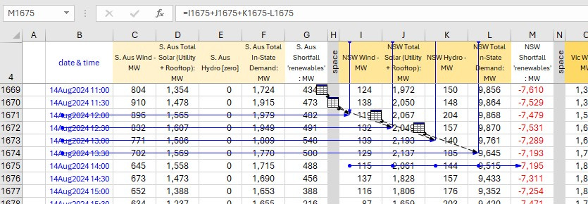
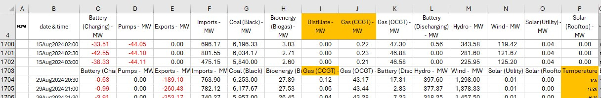
NEM data only implies the Demand in a given State. In-State Demand equals the sum of all the sources of generation for each time interval, because Supply has to equal Demand every minute of every hour of every day (60/24/365¼). Exports are not being used In-State but imports are: the NEM records exports as negative values so the summation holds true. The same is true for battery charging (-ve values) or discharging (+ve values). These calculations are shown in Figure 2A.
Figure 2A: Example Calculation: NSW Statistics 14Aug from NEM Data:

The NEM data does not directly show whether the ‘renewable’ generators In-State are satisfying In-State Demand or not. If they do not there is a Shortfall. Therefore I had to perform a second set of calculations on the gathered data. For a given time interval, the ‘renewable’ sources of power comprise Wind + Solar + Hydro. Subtract In-State Demand from this gives you that interval’s In-State Shortfall. These calculations are shown in Figure 2B.
Figure 2B: Example Calculation: NSW Statistics 14Aug from NEM Data:
Grinding through these data-downloads, data validation checks, and the relevant number-crunching plus plot generation, I produced some example results from the recent Australian winter to provide some glimpses of the rest-of-Australia reality.
NSW has the highest In-State power Demand. Therefore I set the vertical power scale of every State’s plot using the ±12,500 MW necessary to virtually completely capture NSW data: see Figure 3.
Figure 3: NSW Power Data, 10Jul2024 02:00 to 15Sep2024 19:00:
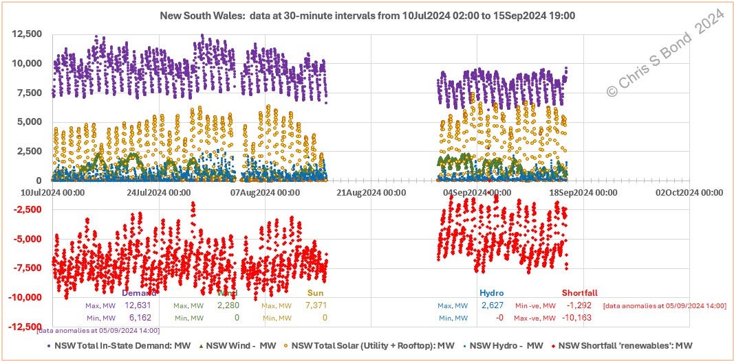
As soon as you plot data with intervals less than a day you see what should be bl**ding obvious: Solar power falls to zero every night, even in sunny Aus. You also see Wind power varying fairly randomly, while Demand follows a regular daily rhythm. The peak In-State NSW Demand of 12,631 MW arose on 15Jul2024 at 18:30 when the temperature was given as 11°C - depths of winter Down Under.
As an aside, when completed, filled up and fully commissioned, the Snowy 2.0 pumped hydro project will have a power capacity of up to 2GW (2,000 MW) and maximum storage of 350 GWh (350,000 MWh). It is located in south-western NSW, fairly close to the border with Vic and also close to the ACT (seat of the Australian Federal Government in Canberra). You can see the magnitude of the Shortfalls of only NSW ‘renewables’ in Figure 3. One Snowy 2.0 won’t be enough to keep NSW’s lights on… but a cynic might suggest Canberra will be just fine.
Anyhow, moving on to other States. South Australia is the darling of ‘renewables’ advocates, so could it prop up its surrounding States with all its surplus Solar and Wind power? Have a look at Figure 4 and see what you think.
Figure 4: S.Aus Power Data, 10Jul2024 02:00 to 15Sep2024 19:00:
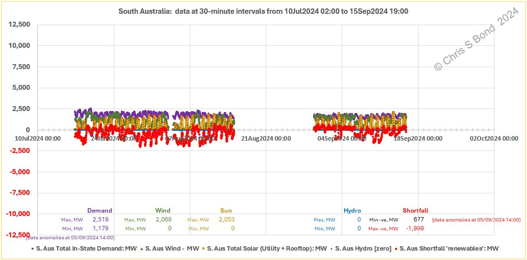
Plotting S.Aus on the same scale as NSW puts this into much better context, yes?
How about Victoria? See Figure 5.
Figure 5: Vic Power Data, 10Jul2024 02:00 to 15Sep2024 19:00:
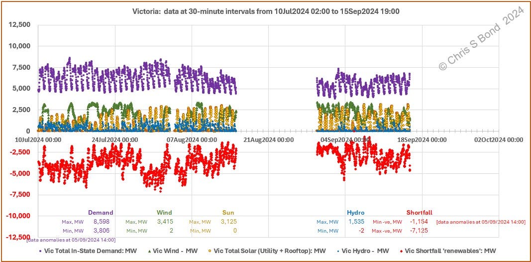
Well yes, Vic power grid handles substantial flows of energy (currently largely provided by burning brown coal, eek!) but its Shortfalls of ‘renewables’ are pretty hefty, especially through the winter period.3
Any hope of an easy rescue by near-tropical Queensland may be dashed by perusal of Figure 6:
Figure 6: Qu Power Data, 10Jul2024 02:00 to 15Sep2024 19:00:
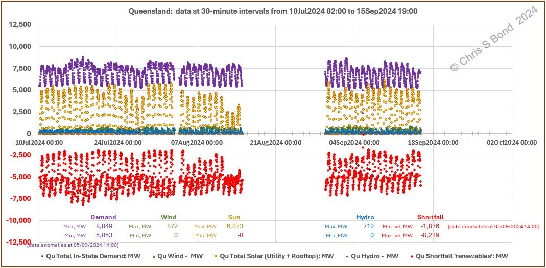
Queensland (Qu) displays similar magnitudes of Demand in a regular pattern as compared with Vic. Qu Solar reaches similar peaks (~6,000 MW) as NSW’s (~7,400 MW) across this winter interval. Qu Shortfalls also persist throughout this interval.
Last but not least, surely they will be rescued from carbon heck by the hydro powerhouse that is Tasmania? Sadly not, see Figure 7.
Figure 7: Tas Power Data, 10Jul2024 02:00 to 15Sep2024 19:00:
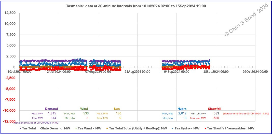
Oh.
But it’s ok, because as we all know ™, ‘the wind is always blowing somewhere’, correct? Restated as ‘it is NEVER not windy everywhere at once’, right? So all we need to do is interconnect the various States with huge-capacity high-voltage direct current (HVDC) cables… and they can share the ‘renewable’ Surpluses from their neighbours when they themselves are experiencing ‘renewable’ Shortfalls.
Ah.
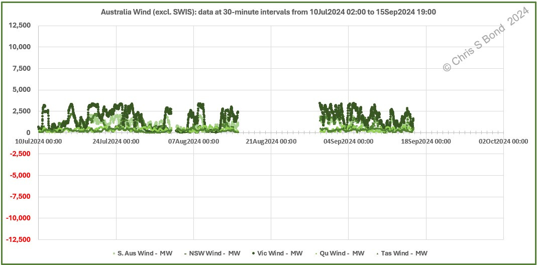
But this is the benefit of doing one’s own analysis of the raw NEM data. I can line up all the Wind data from the various connected States to see how true that ‘NEVER not windy everywhere at once’ assumption really is.
And again, oh.
Figure 8: Wind Power Data, 10Jul2024 02:00 to 15Sep2024 19:00:
But we’ll be ok, because we’re a sunny continent…
Figure 9: Wind, Combined Wind & Combined Solar, and Visible Lulls, 10Jul2024 02:00 to 15Sep2024 19:00:
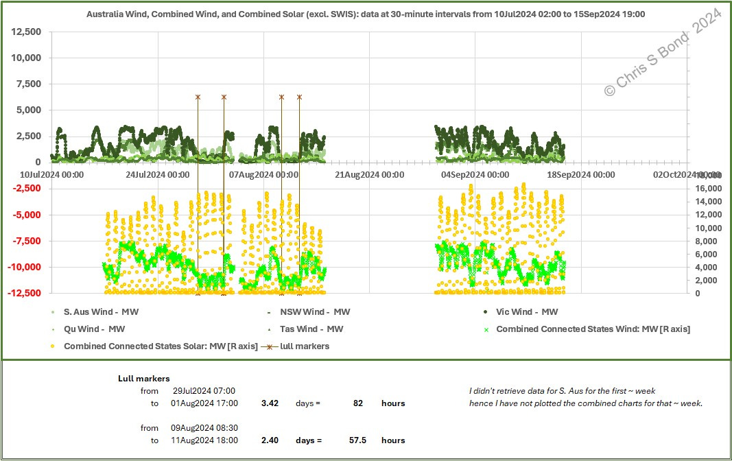
Well that’s the thing. In the relatively short interval covered (10 July to 15 September), I identify two significant Wind lulls lasting 82 hours and 57½ hours respectively. In the longest of those lulls there are three nights of zero Solar generation.
Yes, but electrical energy storage battery cells are getting really really cheap…
That is perhaps true, but all the other electrical equipment, the basic infrastructure and the engineering skills needed to make a functioning battery energy storage system (BESS) are subject to the general inflationary pressures we see all around us.
Anyway, to illustrate how much distributed BESS capacity would help smooth Solar output from grid-connected-Australia I’ve run calculations for a couple of the sunny days included in the charts above. My target in each is to produce steady power equal to the day’s average Solar generation, spread equally across 24 hours.
Example 1, 29 July: the day with the highest peak Solar in the first lull from Figure 9.
Figure 10: BESS for 24 Hours of Combined Solar 29Jul2024:
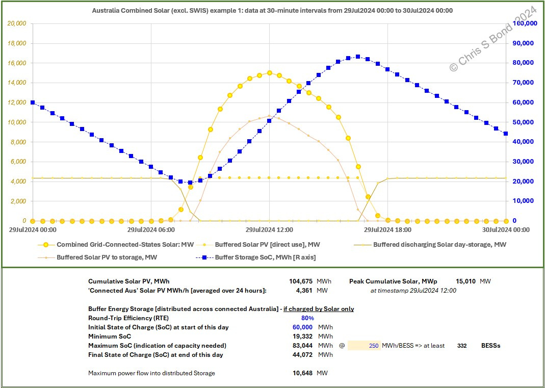
The results for 29Jul2024 are summarised in Figure 10:
Cumulative Solar PV: 104,675 MWh in this 24 hours
Peak Cumulative Solar: 15,010 MW at timestamp 29Jul2024 12:00
Grid-Connected-Aus Solar PV MWh/h [averaged over 24 hours]: 4,361 MW
Buffer Energy Storage [distributed across grid-connected-Australia] - if charged by Solar only:
Round-Trip Efficiency (RTE) 80% 4
Initial State of Charge (SoC) at start of this day 60,000 MWh [assumed]
Minimum SoC 19,332 MWh
Maximum SoC (indication of capacity needed) 83,044 MWh
which => at least 332 BESSs assuming 250 MWh/BESS
Final State of Charge (SoC) at end of this day 44,072 MWh
Maximum power flow into distributed Storage 10,648 MW
[which is over 5 times Snowy 2.0 power capacity]
Example 2, 10 Sep: the day with the highest peak Solar in Figure 9.
Figure 11: BESS for 24 Hours of Combined Solar 10Sep2024:

The results for 10Sep2024 are summarised in Figure 11:
Cumulative Solar PV: 128,865 MWh in this 24 hours
Peak Cumulative Solar: 16,579 MW at timestamp 10Sep2024 12:00
Grid-Connected-Aus Solar PV MWh/h [averaged over 24 hours]: 5,369 MW
Buffer Energy Storage [distributed across grid-connected-Australia] - if charged by Solar only:
Round-Trip Efficiency (RTE) 80% 5
Initial State of Charge (SoC) at start of this day 60,000 MWh [assumed]
Minimum SoC 13,665 MWh
Maximum SoC (indication of capacity needed) 87,386 MWh
which => at least 350 BESSs assuming 250 MWh/BESS
Final State of Charge (SoC) at end of this day 41,570 MWh
Maximum power flow into distributed Storage 11,209 MW
[which is nearing 6 times Snowy 2.0 power capacity]
Of course, in both examples the SoC at the end of the day is lower than at the start because of the round-trip efficiency losses. Wind power would probably make up the shortfall…
Also, I fully realise that there are long duration energy storage (LDES) technologies other than batteries or pumped hydro. Examples include liquid air energy storage (LAES), compressed air energy storage (CAES), gravimetric energy storage, and others. All are yet to be fully commercialised at sufficiently low costs as to be attractive. However, currently Australia seems to be all-in for battery energy storage so that’s the comparator I’ve used in this post.
Curtailment
The more ‘renewable’ generation there is on a grid the more it leads to Diminishing Returns absent immense distributed electricity storage (or additional reliable schedulable Demand such as for hydrogen electrolysers, but that opens a whole different - and expensive - can of worms if your target is to reduce global warming).
To date, the diminishing returns effect has largely been masked for S.Aus because the State’s power flows are relatively tiny, and it can and does export its surpluses to its grid-connected neighbouring States. However, as the neighbouring States in grid-connected-Australia increase their own proportions of ‘renewable’ generation they will collectively and increasing run out of collective Demand at times of Surplus and hence will have to increasingly curtail.
This inevitability of higher and higher curtailment is already evident from some of the data presented. Wind sometimes surges across multiple States (Figures 8 and 9) while they all have essentially the same 24-hour rhythm of Solar surges and nulls.
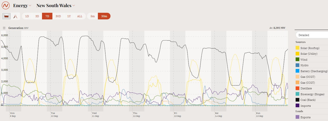
Increasing amounts of curtailment are already visible in some of the NEM views of State power generation. For example in NSW in the latest week up to 15Sep, Utility Solar has been stomped on heavily, see Figure 12.
Figure 12: NEM View of NSW Power Generation, 09-15Sep 2024
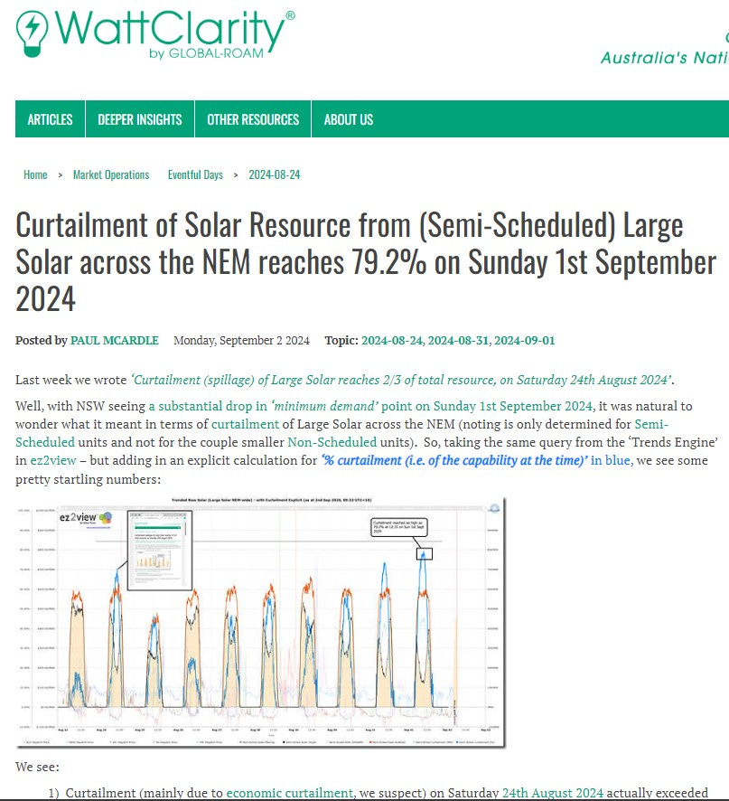
I’m not the only person to have noticed this phenomenon afflicting the Australian ‘renewables’ scene:
Figure 13: WattClarity Report of Solar Curtailment 01Sep 2024
Conclusions
Australia has a very extensive array of large-scale Wind and Solar sampling systems: the existing Wind farms and Solar farms and rooftop Solar installations. The NEM presents the data quite poorly but it is there behind all the NEM’s lurid colours and default charts.
From a very limited sample from that data I have demonstrated that Wind can fall simultaneously and significantly across a large proportion of the Australian continent. I have shown the relative magnitudes of the power flows in grid-connected-Australia and how small the ‘renewables’-leading States actually are. I have also shown that the major States all have large Shortfalls in their ‘renewable’ power generation as compared with their Demands.
If I lived in Australia I would be hoping that the NEM (or whoever is responsible for energy data) should collect it in consistent format (i.e. the same set of columns for every State with zeros in any column that is not applicable to that State). I would also be hoping that current data be made available continuously with good (30 minute intervals or better) granularity; and that as much historic data as possible was provided in the same consistent format.
Furthermore, I would then be hoping that whoever is setting Australian energy policy perform something like the analysis presented herein, to demonstrate using years of real historical data that, whatever the future energy plan is and whatever the modelling might suggest, the lights will stay on whatever the season.
Copyright © 2024 Chris S Bond
Disclaimer: Opinions expressed are solely my own.
This material is not peer-reviewed.
I am against #GroupThink.
Your feedback via polite factual comments / reasoned arguments welcome.
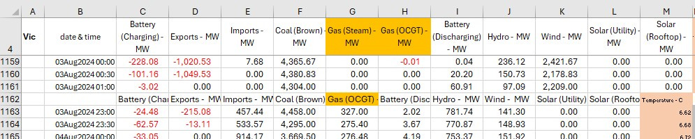
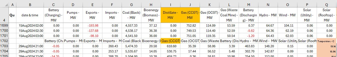
Some examples of the CONTENT of NEM data-files changing week to week:
I don’t know nor care whether the NEM is wholly responsible for the data-gathering or its presentation: I’m just using “NEM” as shorthand.
It does get cold in Victoria in winter: around 3.3°C on 04Aug2024 at 07:30 according to the NEM data.
The charging batteries versus discharging batteries data for three example States indicates actual round-trip efficiencies (RTEs) are:
S.Aus 80%;
NSW 76%;
and Vic 81%.
Thus I have used 80% RTE in the BESS examples.
See footnote 4
I guess it's not surprising that the wind is so 'coordinated' in Australia - it's very flat. There's essentially nothing in the way if it's coming from the East and if it's coming off the ocean for those in the South-East, well, they're all clustered inside what ranges there are.
Would be interested to see an analysis of Ireland's efforts.
Great analysis. I would add that if Australia will have significant problems getting to 100% wind+solar electricity generation, then the rest of the world will have it much, much worse.
Australia has high levels of solar radiance across a massive territory and a relatively small population.